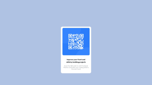
Flexbox , Box-model Bootstrap

Solution retrospective
I redid this solution because I have now come to terms with responsiveness , I loved the outcome.
Please log in to post a comment
Log in with GitHubCommunity feedback
- @Andrewwangari
Thank you for taking your time to look at my code and offering some feedback, I really appreciate. Let me implement the changes as I learn the concepts you have shared with me. I assume the commented code is where to implement the change. Thank you.
- @0xabdulkhaliq
Hello there 👋. Congratulations on successfully completing the challenge! 🎉
- I have other recommendations regarding your code that I believe will be of great interest to you.
CSS 🎨:
- Looks like the component has not been centered properly. So let me explain, How you can easily center the component without using
margin
orpadding
.
- We don't need to use
margin
andpadding
to center the component both horizontally & vertically. Because usingmargin
orpadding
will not dynamical centers our component at all states
- To properly center the component in the page, you should use
Flexbox
orGrid
layout. You can read more about centering in CSS here 📚.
- For this demonstration we use css
Grid
to center the component.
body { min-height: 100vh; display: grid; place-items: center; }
- Now remove these styles, after removing you can able to see the changes
.box2 { margin: 150px auto; }
- Now your component has been properly centered
.
I hope you find this helpful 😄 Above all, the solution you submitted is great !
Happy coding!
- @ecemgo
Some recommendations regarding your code that could be of interest to you.
- If you want to make the card centered both horizontally and vertically, you'd better add flexbox and
min-height: 100vh
to the body - You can add the recommended color for the screen to the
body
body { background: hsl(212, 45%, 89%); display: flex; flex-direction: column; justify-content: center; align-items: center; min-height: 100vh; }
- If you use
max-width
, the card will be responsive - You'd better update
padding
to give a gap between the content and the border of the card
.box3 { /* padding: auto; */ padding: 15px; /* border: 1px solid hsl(212, 35%, 85%); */ border-radius: 10px; /* width: 300px; */ max-width: 300px; /* height: 500px; */ background-color: hsl(0, 0%, 100%); }
- In addition to that above, in order to make the card responsive and the image positioned completely on the card, you'd better add
width: 100%
to the img
img { /* width: 300px; */ width: 100%; border-radius: 5%; /* padding: 10px; */ }
- You'd better update the padding of the
p
p { /* padding: 20px; */ padding: 10px; }
- You don't need to define
.box2
and you can remove it
/* .box2 { border: 1px solid hsl(212, 35%, 85%); margin: 150px auto; width: 1500px; height: 700px; display: flex; align-items: center; justify-content: center; background-color: hsl(219, 71%, 75%); } */
- Finally, the solution will be responsive if you follow the steps above
Hope I am helpful. :)
- If you want to make the card centered both horizontally and vertically, you'd better add flexbox and
Join our Discord community
Join thousands of Frontend Mentor community members taking the challenges, sharing resources, helping each other, and chatting about all things front-end!
Join our Discord