Skip to content
  • Unlock Pro
  • Log in with GitHub
Solution
Submitted over 1 year ago

flexbox, position and @media queries

aneeshthakur67•160
@aneeshthakur67
A solution to the Social links profile challenge
View live sitePreview (opens in new tab)View codeCode (opens in new tab)
Code
Select a file

Please log in to post a comment

Log in with GitHub

Community feedback

  • Rebecca Padgett•2,100
    @bccpadge
    Posted over 1 year ago

    Hello @aneeshthakur67. Congratulations on completing this challenge!!!🎉

    Here are a few suggestions you might want to implement to improve your solution.

    HTML 📃:

    • Images must have alt text for screen readers

    Example: 
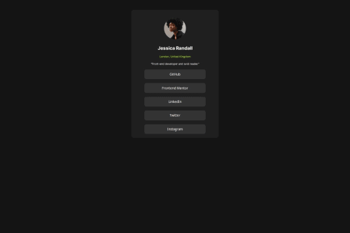
<img class="profile-pic" src="./assets/images/avatar-jessica.jpeg" alt="headshot of Jessica Randall">

    • Every website needs to have a h1 and you can do one of two things.
      • Wrap the text Jessica Randall in a h1
    • Wrap the title of the website in a h1 like this <h1>Frontend Mentor | Social links profile</h1> for screen readers and keep the text Jessica Randall in a h2
    • When using Heading Tags be sure to use them in chronological order.

    I use this .visually-hidden CSS class

    .visually-hidden:not(:focus):not(:active):not(:focus-within) {
      clip-path: inset(50%);
      height: 1px;
      overflow: hidden;
      position: absolute;
      white-space: nowrap; 
      width: 1px;
    }
    
    
    • The code below needs to improve upon
    <div class="social-buttons">
      <button class="buttons">GitHub</button>
      <button class="buttons">Frontend Mentor</button> 
      <button class="buttons">LinkedIn</button> 
      <button class="buttons">Twitter</button>
      <button class="buttons">Instagram</button> 
    </div>
    

    Be sure to understand the purpose of a HTML tags when you code your projects.

    button and links are two different things

    More info📚:

    • button vs links

    Example:

    <ul>
     <li>
     <a href="www.github.com">Github </a>
    </li>
    </ul>
    

    CSS 🎨:

    • To center your component in the middle of the page use Flexbox or CSS Grid on the body

    Flexbox

    body{
    display:flex;
    justify-center: center;
    align-items: center;
    min-height: 100vh;
    
    }
    

    CSS Grid

    body{
    display: grid;
    place-content:center;
    min-height:100vh;
    }
    

    You can remove the styles that are commented out because it unnecessary to add styles when you don't need them

    .container {
     /* position: relative; */
     /* top: 10rem; */
     /* margin: 0 auto; */
     /* width: 25%; */
      /* display: flex; */
     /* flex-direction: column; */
    /*align-items: center;*/
    /*justify-content: center; */
     background: hsl(0, 0%, 12%);
    border-radius: 10px;
    }
    

    When you use max-width on your .container you don't need to use media queries Add this code below and use rem units improve accessibility

    Pixels to rem converter

    You can play around with the padding value

    .container{
      max-width: 25rem;  
      padding: 2rem; 
    }
    
    img{
     max-width: 100%
     display: block;
    }
    
    h2, p{
    text-align: center;
    }
    

    I hope you find this useful and don't hesitate to reach out if you have any questions

    Marked as helpful

Join our Discord community

Join thousands of Frontend Mentor community members taking the challenges, sharing resources, helping each other, and chatting about all things front-end!

Join our Discord
Frontend Mentor logo

Stay up to datewith new challenges, featured solutions, selected articles, and our latest news

Frontend Mentor

  • Unlock Pro
  • Contact us
  • FAQs
  • Become a partner

Explore

  • Learning paths
  • Challenges
  • Solutions
  • Articles

Community

  • Discord
  • Guidelines

For companies

  • Hire developers
  • Train developers
© Frontend Mentor 2019 - 2025
  • Terms
  • Cookie Policy
  • Privacy Policy
  • License

Oops! 😬

You need to be logged in before you can do that.

Log in with GitHub

Oops! 😬

You need to be logged in before you can do that.

Log in with GitHub

How does the accessibility report work?

When a solution is submitted, we use axe-core to run an automated audit of your code.

This picks out common accessibility issues like not using semantic HTML and not having proper heading hierarchies, among others.

This automated audit is fairly surface level, so we encourage to you review the project and code in more detail with accessibility best practices in mind.

How does the CSS report work?

When a solution is submitted, we use stylelint to run an automated check on the CSS code.

We've added some of our own linting rules based on recommended best practices. These rules are prefixed with frontend-mentor/ which you'll see at the top of each issue in the report.

The report will audit all CSS, SCSS and Less files in your repository.

How does the HTML validation report work?

When a solution is submitted, we use html-validate to run an automated check on the HTML code.

The report picks out common HTML issues such as not using headings within section elements and incorrect nesting of elements, among others.

Note that the report can pick up “invalid” attributes, which some frameworks automatically add to the HTML. These attributes are crucial for how the frameworks function, although they’re technically not valid HTML. As such, some projects can show up with many HTML validation errors, which are benign and are a necessary part of the framework.

How does the JavaScript validation report work?

When a solution is submitted, we use eslint to run an automated check on the JavaScript code.

The report picks out common JavaScript issues such as not using semicolons and using var instead of let or const, among others.

The report will audit all JS and JSX files in your repository. We currently do not support Typescript or other frontend frameworks.

Oops! 😬

You need to be logged in before you can do that.

Log in with GitHub