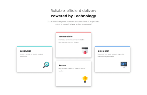
Not Found
Not Found
Not Found
Not Found
Not Found
Not Found
Not Found
Not Found
Not Found
Not Found
Not Found
Not Found
Not Found
Not Found
Not Found
Not Found
Not Found
Not Found
Not Found
Not Found

Submitted

flex-direction, flex-align, justify content

Aymin 140

@ayminahmed

Desktop design screenshot for the Four card feature section coding challenge

This is a solution for...

  • HTML
  • CSS
1newbie
View challenge

Design comparison


SolutionDesign

Solution retrospective


Development certainly becomes much easier if the image is first translated into a figma file to clarify the margins / paddings. More time (and energy) is saved during the development process than in expended in translating the design.

Don't like using fractional rems, seems hacky. Am I visually splitting the spacing incorrectly, and ending with wrong margins / paddings for various components?

Will be grateful for ANY feedback.

Community feedback

@steventoben

Posted

Fractional rems may seem hacky but it's actually the best way to size things, and the values don't have to be so exact. Just for fun I tried adjusting the styles on a card with clean styles and it looks pretty much the same (at least on my screen). On the div with className "category-card card-1", I applied flex in column direction to that card and the styles became a lot cleaner. I got rid of the width, height, margins, padding values and set padding to 2rem and margin to 1rem. Then on the img inside that card I got rid of the absolute positioning and set order: 1, align-self: end, margin-top: 4rem and that looks essentially the same.

This looks good and is pretty much spot on to the design, and there's tons of ways to go about styling things (and the way I did it may not actually work, I was just trying to show that there's tons of ways to go about styling). Being exact isn't necessary, it's ok to round your rems to the nearest whole number or 0.5. I'd definitely recommend trying to not explicitly set width and height, especially in pixels. If you can, setting a max (or min) height/width in rem is a good way to go.

I think this looks nice, I don't think being so exact is necessary. You could try rounding rems on your next project, if you don't like it then you can use the exact values if you feel more comfortable with that.

2
Aymin 140

@ayminahmed

Posted

Good things you mentioned. I actually planned about using flex-column for the mobile version, and then completely forgot about it.

I see. I was going with exact values because I was trying to simulate those 'pixel perfect' type of projects.

And based on your recommendation, I will try finding more even rem numbers for the next project, and rely more on CSS to place the elements for me, eg relying on flex.

0

Please log in to post a comment

Log in with GitHub
Discord logo

Join our Discord community

Join thousands of Frontend Mentor community members taking the challenges, sharing resources, helping each other, and chatting about all things front-end!

Join our Discord