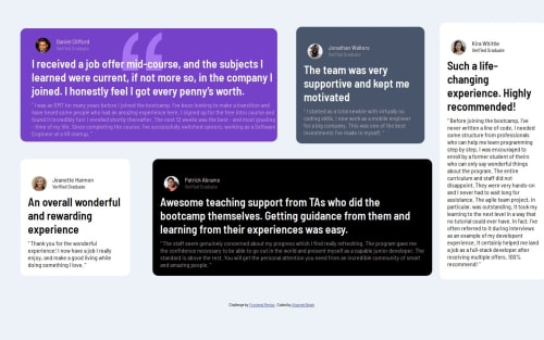
Flexible Grid System for Multi-Column Layouts

Solution retrospective
I'm most proud of creating a responsive grid layout that effectively manages different screen sizes and item placements. Next time, I would focus on optimizing the design for more complex interactions and enhancing accessibility features. Additionally, I’d explore more advanced CSS techniques to further streamline and simplify the layout.
What challenges did you encounter, and how did you overcome them?I faced challenges with ensuring that items positioned absolutely did not overlap text and maintaining responsive design across various screen sizes. I overcame these issues by carefully adjusting CSS properties and using media queries to adapt the layout for different devices. Testing and iterative refinement helped ensure a clean and functional design.
What specific areas of your project would you like help with?I would like feedback on optimizing the grid layout for better responsiveness, especially how to ensure items properly align across different screen sizes. Additionally, guidance on improving the accessibility features and enhancing visual hierarchy would be valuable. Any suggestions for refining CSS techniques or layout efficiency are also appreciated.
Please log in to post a comment
Log in with GitHubCommunity feedback
No feedback yet. Be the first to give feedback on AHAMED NAJAH's solution.
Join our Discord community
Join thousands of Frontend Mentor community members taking the challenges, sharing resources, helping each other, and chatting about all things front-end!
Join our Discord