


@ApplePieGiraffe
Posted
Hi there, Sky! 👋
Nice effort on this challenge! 👏 It's cool to see that you added some extra touches through animations! 😀
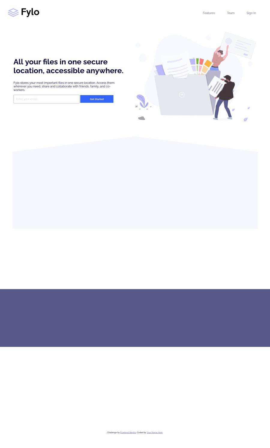
I noticed that a horizontal scroll bar appears along the bottom of the page in the desktop layout when you scroll down the page (perhaps because of some of the animations that take place). Consider adding something like overflow-x: hidden to the body to prevent this from happening.
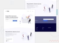
I think adding the wavy background shape in the hero section of the page as a background image in that hero section would be a good idea. Then you could add background-size: cover and the background shape will always fill up the entire width of the section (something that it doesn't always do in the mobile layout, at the moment). 😉
About the sizing of the illustration in the "Stay productive, wherever you are" section—I don't know if you'd want to make it the same height as its parent section all of the time because that might make it difficult to make that section respond well. I think allowing the width of the image to scale down whenever necessary (such as when the size of the screen decreases and there needs to be room for the text content of that section) would be a little better.
Hope those one or two tips help! 🙂
Keep coding (and happy coding, too)! 😁
Marked as helpful
@Skyz03
Posted
@ApplePieGiraffe Thank you for your feedback will surely improve it out!
@ApplePieGiraffe
Posted
@Skyz03
Glad to help! 👍
