Skip to content
  • Unlock Pro
  • Log in with GitHub
Solution
Submitted 11 months ago

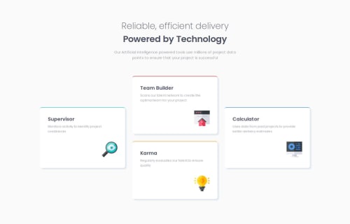
Four card feature section -HTML, CSS, Flexbox

P
Jan•290
@Jan-Dev0
A solution to the Four card feature section challenge
View live sitePreview (opens in new tab)View codeCode (opens in new tab)

Solution retrospective


What challenges did you encounter, and how did you overcome them?

I had to experiment a bit with Flexbox because the elements didn't always occupy the intended space as I had planned.

What specific areas of your project would you like help with?

I would appreciate some general tips on using Flexbox for layout and feedback on whether I've made any mistakes or if there are better approaches I could use.

Code
Select a file

Please log in to post a comment

Log in with GitHub

Community feedback

  • Teodor Jenkler•4,040
    @TedJenkler
    Posted 11 months ago

    Hi @Jan-Dev0,

    Nice job on the project! I noticed a small issue with responsiveness. I’d recommend always using rem or % for sizing, and avoiding fixed widths—use max-width and min-width instead. Like mentioned in previous feedback, the easiest way to tackle this challenge is by using Grid, but it’s totally doable with Flexbox if you play around with media queries. You could use three flex parents, though Grid is generally recommended for more control.

    On several breakpoints, there are width and height inconsistencies. I’d suggest looking into that and trying to use as little CSS as possible—it often simplifies things.

    To improve SEO and accessibility, consider using <section> tags instead of <div>, with aria-label, aria-labelledby, or title attributes to make the content more accessible.

    Your code is heavily nested with <div> elements. For the next project, I’d recommend minimizing the use of <div>s to keep the code cleaner and more readable. For instance, using flex-column or flex-row instead of extra <div> containers can help organize and stack elements more efficiently.

    Keep up the great work!

    Best, Teodor

    Marked as helpful
  • Aymen developer•750
    @aymenthedeveloper
    Posted 11 months ago

    for a layout like this its better to use grid since it allows us to define the grid cols and rows and then we can use the properties grid-row and grid-column to position each element exactly in the grid, which makes thing much easier.

    i personally used flex box for this project when i did it but if i would go back an improve it i will defiantly use grid.

    you can check my solution if you want to see how i did it using flex box.

    Marked as helpful

Join our Discord community

Join thousands of Frontend Mentor community members taking the challenges, sharing resources, helping each other, and chatting about all things front-end!

Join our Discord

Stay up to datewith new challenges, featured solutions, selected articles, and our latest news

Frontend Mentor

  • Unlock Pro
  • Contact us
  • FAQs
  • Become a partner

Explore

  • Learning paths
  • Challenges
  • Solutions
  • Articles

Community

  • Discord
  • Guidelines

For companies

  • Hire developers
  • Train developers
© Frontend Mentor 2019 - 2025
  • Terms
  • Cookie Policy
  • Privacy Policy
  • License

Oops! 😬

You need to be logged in before you can do that.

Log in with GitHub

Oops! 😬

You need to be logged in before you can do that.

Log in with GitHub

How does the accessibility report work?

When a solution is submitted, we use axe-core to run an automated audit of your code.

This picks out common accessibility issues like not using semantic HTML and not having proper heading hierarchies, among others.

This automated audit is fairly surface level, so we encourage to you review the project and code in more detail with accessibility best practices in mind.

How does the CSS report work?

When a solution is submitted, we use stylelint to run an automated check on the CSS code.

We've added some of our own linting rules based on recommended best practices. These rules are prefixed with frontend-mentor/ which you'll see at the top of each issue in the report.

The report will audit all CSS, SCSS and Less files in your repository.

How does the HTML validation report work?

When a solution is submitted, we use html-validate to run an automated check on the HTML code.

The report picks out common HTML issues such as not using headings within section elements and incorrect nesting of elements, among others.

Note that the report can pick up “invalid” attributes, which some frameworks automatically add to the HTML. These attributes are crucial for how the frameworks function, although they’re technically not valid HTML. As such, some projects can show up with many HTML validation errors, which are benign and are a necessary part of the framework.

How does the JavaScript validation report work?

When a solution is submitted, we use eslint to run an automated check on the JavaScript code.

The report picks out common JavaScript issues such as not using semicolons and using var instead of let or const, among others.

The report will audit all JS and JSX files in your repository. We currently do not support Typescript or other frontend frameworks.

Oops! 😬

You need to be logged in before you can do that.

Log in with GitHub

Oops! 😬

You need to be logged in before you can do that.

Log in with GitHub