


Szymon Rojek• 4,540
@SzymonRojek
Posted
**Hi Victor, **
Well done :D
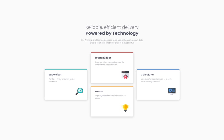
I have checked your HTML structure and RWD by the inspector in my browser, a few tips below:
- instead of div class="text" I'd suggest to use the header tag;
- instead of div class="cardsContainer" I would suggest to use the ** tag** just to indicate the main content on a page;
- you have used so many nested wrappers divs and this is unnecessary => try to simplify it;
- instead of the h3 it will be better to use the h2 (we can not skip the headings);
- alt text => In this project, images have an only a decorative role - that's a reason why alt text should be provided as an empty (alt="") so img can be ignored by assistive technologies, such as screen readers;
- don't have to use ID's here => that's a reason why we have got classes. I'd suggest learning BEM naming convention;
- RWD: check a project by using the inspector in your browser on different devices, especially tablets => from 550px till 820px (approx) the layout doesn't look well. You can start from one column, then create two rows with two boxes each and finally get the design desktop pattern;
- you have used an explicit width and height (container and cards) => important: that's not a good practice especially that you want to use the flexbox or grid. It is essential to understand well the height and width vs min-height/max-height & min-width/max-width. You shouldn’t need to give items height unless they have a background or absolutely-positioned or floated elements within them that would not normally be accounted for in the height of an element. Experienced developers use min-height and min/max-width more than anything else. It allows elements to grow and shrink.
I'd recommend reading more about semantic tags, headings, alt, width and height when using flexbox && grid.
Ps. Please, don't forget to upvote any comments on here that you find helpful.
Greetings :D
2
