Submitted about 1 year agoA solution to the Four card feature section challenge
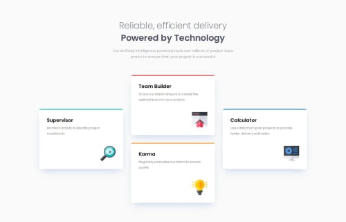
Four card feature section

@almendev
Solution retrospective
What challenges did you encounter, and how did you overcome them?
I found some details in the design and like a littler overlap between the two lines of the title.
Another thing I found was the padding in the feature card for 375px where the distance between the border and the card title was different than the one between the border and the paragraph.
What specific areas of your project would you like help with?I would like help to find the same results with less lines of css, specially in the media query section.
Code
Please log in to post a comment
Log in with GitHubCommunity feedback

Join our Discord community
Join thousands of Frontend Mentor community members taking the challenges, sharing resources, helping each other, and chatting about all things front-end!
Join our Discord