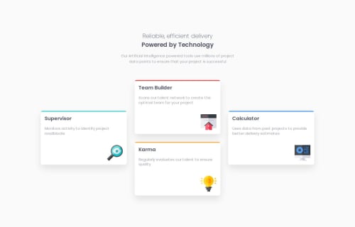
Four card feature section

Solution retrospective
I'm proud of how I approached the styling and layout of this project using the CUBE CSS methodology. It helped me create a clean, modular structure for the styles, which makes the project more maintainable.
While working with SCSS, I learned the importance of clear and descriptive variable names. In this project, some of the names I used for variables (e.g., $spacing-unit, $breakpoints) could have been more descriptive to improve clarity. Next time, I’d be more careful about naming conventions to ensure the variables are easily understood by other developers.
What challenges did you encounter, and how did you overcome them?- Debugging SCSS and Sass Compilation Errors:
One of the first challenges I encountered was when I started working with Sass, especially dealing with compilation errors. For instance, I ran into issues where Sass variables or mixins weren’t being recognized, which was causing the styles not to render correctly. A major problem arose with the @use directive and how I was trying to access variables or maps from other partials.
I spent time reading through Sass documentation and experimenting with how to properly scope and import variables using @use and @forward. I learned that Sass variables and functions need to be accessed through their namespaces after being imported with @use. This was a huge learning curve, as initially, I was trying to use them directly like in previous Sass versions. By refactoring my imports to include the correct namespaces (e.g., colors.$primary), I was able to fix these issues. Additionally, debugging in the browser’s developer tools (checking computed styles) helped me identify where things were going wrong, which made it easier to troubleshoot the missing styles.
What specific areas of your project would you like help with?How can I further improve the flexibility and responsiveness of my grid layout? Are there best practices for ensuring that elements in my grid stay proportional and maintain consistent spacing across various screen sizes? Is there a way to optimize my media queries to make the layout even more adaptable?
Please log in to post a comment
Log in with GitHubCommunity feedback
No feedback yet. Be the first to give feedback on Łukasz Gwarda's solution.
Join our Discord community
Join thousands of Frontend Mentor community members taking the challenges, sharing resources, helping each other, and chatting about all things front-end!
Join our Discord