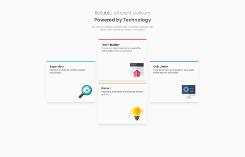
Submitted 9 months agoA solution to the Four card feature section challenge
Four card feature section
react, tailwind-css, sass/scss

@herojk64
Code
Please log in to post a comment
Log in with GitHubCommunity feedback
- @rafbar2000rr
When resizing the window to mobil, I noticed that the card's width decreases as I move. In order to turn from desktop to mobil with a fixed width I would add on each of the four sections on App.tsx this: <section className = "max-w-[365px]"> .
Besides I noticed that the heading and the group of cards didn't move together as I resized the window, so I would add on App.tsx: flex, flex-col and items-center classes this way: <div className='App flex flex-col items-center'>
Marked as helpful

Join our Discord community
Join thousands of Frontend Mentor community members taking the challenges, sharing resources, helping each other, and chatting about all things front-end!
Join our Discord