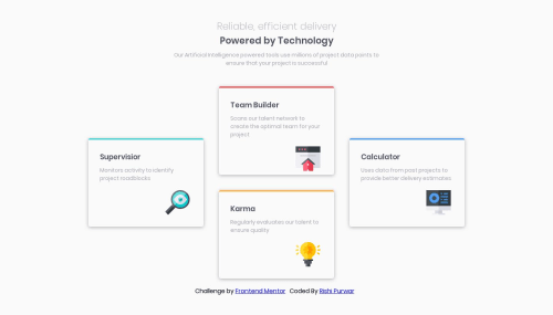
Four card feature section

Solution retrospective
This is my first submission on frontend mentor. Please take a moment to leave your feedback.
Please log in to post a comment
Log in with GitHubCommunity feedback
- @LeshyNL
Your solution seems to work well at both the 375px and 1440px marks as indicated in the challenge, so well done.
However, it doesn't work so well at widths between those, as it shows the desktop layout from 376px and up (which is usually too wide and does not fit).
The reason is that you seem to have built the desktop layout first, and then added a media query to make it work on mobile. It is generally advisable to do it the other way around: build the CSS for the mobile layout first, then add media queries for wider layouts. That way, you will always have a website on which the content fits, as wider layouts do not show until the screen is actually wide enough.
It is just a small change, but should make a big difference on more complex challenges and pages! :)

Join our Discord community
Join thousands of Frontend Mentor community members taking the challenges, sharing resources, helping each other, and chatting about all things front-end!
Join our Discord