Submitted over 5 years agoA solution to the Four card feature section challenge
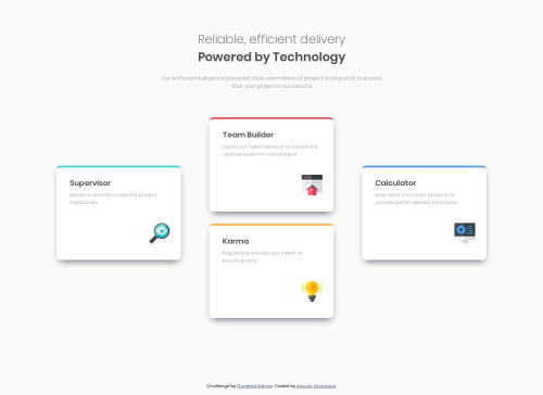
Four card feature section

@aayush182
Solution retrospective
Please give feedback on my solution.
Code
Please log in to post a comment
Log in with GitHubCommunity feedback
- @sonickonic
Congrats on submitting your first solution! it looks amazing!
You've currently got two h1 elements, it will be better to use it once as it can cause accessibility issues. Two ways to solve it:
- Wrap all of that text as a single h1 and use a span element inside it to separate the text.
- Use h1 for the main heading and h2 for the sub-title.
Although it is a pixel perfect solution for the wide-screen, the mobile version is slightly off. Try next time to use min-width media queries instead of max-width. Starting from the mobile-first can lead to more simple solution)
Good job!

Join our Discord community
Join thousands of Frontend Mentor community members taking the challenges, sharing resources, helping each other, and chatting about all things front-end!
Join our Discord