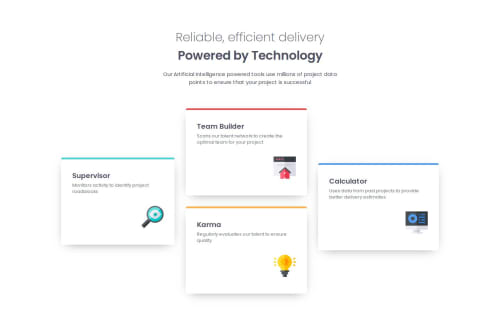
Four card feature section

Solution retrospective
I think my solution looks a lot like the design provided. I'm particularly proud of the use of flexbox for the cards. What i could do different next is that I perhaps would replace flexbox with grid.
What challenges did you encounter, and how did you overcome them?I had the most trouble getting the size of cards the same using flexbox. I had to look some things up using MDN Docs. I also had trouble with the color of the body background. The grey and white colors provided didn't seem to match the background color in the design. I decided to go for white because this was the color that came closest.
What specific areas of your project would you like help with?I would like some tips on my code (HTML & CSS). Maybe there are things I could have done different or code that I could have written shorter.
Please log in to post a comment
Log in with GitHubCommunity feedback
No feedback yet. Be the first to give feedback on KrisvHeij's solution.
Join our Discord community
Join thousands of Frontend Mentor community members taking the challenges, sharing resources, helping each other, and chatting about all things front-end!
Join our Discord