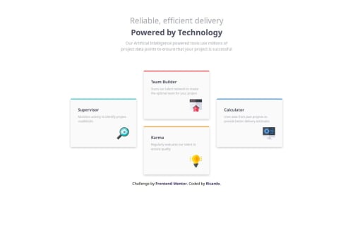
Four-card-feature-section

Solution retrospective
I learned how to use grid areas and also how to make a layout using flexbox. the next time ill like to organize better the css, i think that looks like a mess but ill improve it later.
What challenges did you encounter, and how did you overcome them?In how ti make the layout look like the design image, i tried to do it with flexbox but that would make the responsive part a litlle bit hard, so i make it with grid template areas and used a media query to make it responsive.
What specific areas of your project would you like help with?I think that my css its nor organized so some tutorial or guide on how to make it look good for other people would be great also there is something that i tried to do in the css when you do a media and was like this:
@media(max-width: 800px){
    main{
        grid-template-areas: none;
        grid-template-columns: repeat(auto-fill,minmax(250px,1fr));
        width: 80%;
        min-width: 600px;
    }
}
But didnt work because all the elements where overlapping each other.
Please log in to post a comment
Log in with GitHubCommunity feedback
No feedback yet. Be the first to give feedback on Ricardo Alberto Carrero Bator's solution.
Join our Discord community
Join thousands of Frontend Mentor community members taking the challenges, sharing resources, helping each other, and chatting about all things front-end!
Join our Discord