Four Card Feature Section

Solution retrospective
Coming into this project, I already had some knowledge of CSS Grid and Flexbox. I'm taking a course on Udemy and have been using Mimo for the past 2 months.
(Check out the resource section to see all the website's helpful things that assisted me throughout the project) I started the 'Mobile-First workflow' but didn't prefer it. Ultimately, I restarted the project and wrote my code starting from the 'Desktop-First workflow.
For the next project, I will try again with the ' Mobile-First' workflow. The second time around would maybe be better.
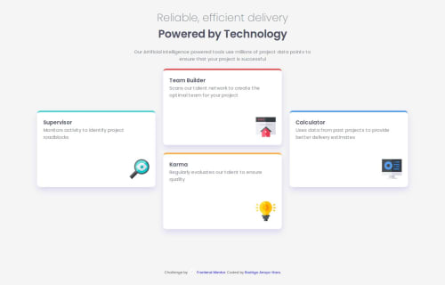
What challenges did you encounter, and how did you overcome them?The challenges that I encounter were :
--aligning the header text towards the center -Corrected by adding a width and then a margin: 0 auto; to center it
--the positioning of the grid-items -Corrected it by utilizing the align-self flexbox property. I go into detail regarding this with screenshots. I recommend you check it out. It's a pretty cool rule.
What specific areas of your project would you like help with?Nothing in particular so far, however, if there are any tips or advice, please share them with me as I'm always curious about any tips or tricks that could improve my code. Happy coding & blessings!
Please log in to post a comment
Log in with GitHubCommunity feedback
- @ImagineBillie
nice

Join our Discord community
Join thousands of Frontend Mentor community members taking the challenges, sharing resources, helping each other, and chatting about all things front-end!
Join our Discord