Submitted over 1 year agoA solution to the Four card feature section challenge
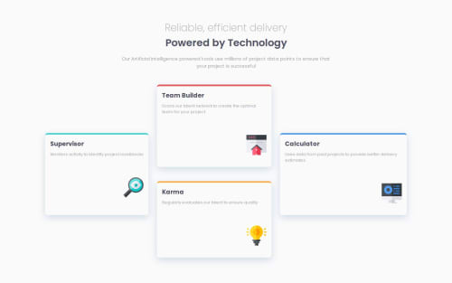
four card feature section

@Shakil-a
Solution retrospective
What are you most proud of, and what would you do differently next time?
most proud :
- worked with CSS grid and flexbox
- added media query for larger screens -used mobile first approach for the first time
what i would do differently:
- transition more smoothly when going from smaller screen sizes to larger ones
challenge and solution 1: how to code the design for the desktop version of the challenge solution: i learnt more and practised css grid on w3schools before attempting and also learn negative margin values
challenge and solution 2:
- how to create the box shadow around the cards: I had searched up the box shadow property and there was a site you can copy and paste from, once i found a good shadow that looked similiar to the one in thre design, i then used the dev tools to adjust the color and blur to get it closer to the design.
i would like help on:
- if there was a better way to layout the four cards on desktop and mobile
- any bad practises that i need to stop before going for my next project -how to layout the design better on mobile so it looks smoother when going from smaller screen sizes to larger ones
- anything else that you spot is not the right way
any feedback would be appreciated, thank you
Code
Loading...
Please log in to post a comment
Log in with GitHubCommunity feedback
No feedback yet. Be the first to give feedback on Shakil ahmed's solution.
Join our Discord community
Join thousands of Frontend Mentor community members taking the challenges, sharing resources, helping each other, and chatting about all things front-end!
Join our Discord