Not Found
Not Found
Not Found
Not Found
Not Found
Not Found
Not Found
Not Found
Not Found
Not Found
Not Found
Not Found
Not Found
Not Found
Not Found
Not Found
Not Found
Not Found
Not Found
Not Found

Submitted

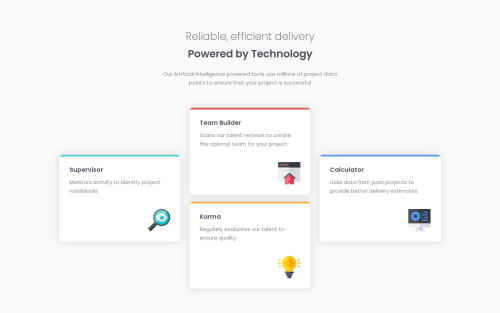
Four card feature section (Flexbox used)

SathishVM 280

@SathishVM

Desktop design screenshot for the Four card feature section coding challenge

This is a solution for...

  • HTML
  • CSS
1newbie
View challenge

Design comparison


SolutionDesign

Solution retrospective


I used Flexbox for aligning the features section.Any feedback means a lot to me and appreciated. :)

Community feedback

Paz Spera 170

@pazspera

Posted

Really liked the way you used .d-flex to organize the layout for tablets. It keeps the spirit of the original design and it's a very practical and simple solution.

0

SathishVM 280

@SathishVM

Posted

@PazS33

Thank You @PazS33 for your Feedback and I'm very much happy by your Words. I had seen the same challenge solution that you have been done and I replied for it.

See it :)

0

Please log in to post a comment

Log in with GitHub
Discord logo

Join our Discord community

Join thousands of Frontend Mentor community members taking the challenges, sharing resources, helping each other, and chatting about all things front-end!

Join our Discord