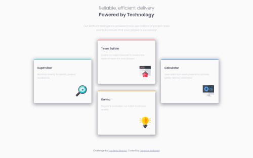
Not Found
Not Found
Not Found
Not Found
Not Found
Not Found
Not Found
Not Found
Not Found
Not Found
Not Found
Not Found
Not Found
Not Found
Not Found
Not Found
Not Found
Not Found
Not Found
Not Found

Submitted

Four Card Feature Section

@flo1244

Desktop design screenshot for the Four card feature section coding challenge

This is a solution for...

  • HTML
  • CSS
1newbie
View challenge

Design comparison


SolutionDesign

Solution retrospective


Can someone review and give their thoughts on this project? Would it have been better to use CSS Grid instead of Flexbox? I also had problem when I changed the body text-size up to 15px it would expand the boxes and through everything off. How could I correct this without having the boxes scrunch back together and become offset?

#coding-newbie

Thanks in advance :)

Community feedback

argel omnes 1,800

@argelomnes

Posted

Hey Florence,

I'm getting a 404 when I clicked the preview ang view code buttons. Your repo is set to private perhaps?

Can't answer the text-size issue and the last question if I can't preview your work. But for the first one, I'd reach for Grids for this layout. I also prefer not having team builder and karma grouped into a container. This makes it more flexible for me to reposition these cards. This is also achievable with flexbox. But Grids feels less work.

Marked as helpful

0

@flo1244

Posted

@argelomnes Sorry about that I was having some problems with Github. I corrected the issue and updated the links.

0
argel omnes 1,800

@argelomnes

Posted

@flo1244 Awesome! I believe this challenge uses 15px both on mobile and desktop. So you should use it on both breakpoints. That said, the text-size isn't really the cause. It's absolute positioning. You may continue with this if you like. Adjusting left and right will fix your layout.

However, I suggest not using absolute positioning. This will break your layout at first. If you go with flexbox, my tip is to group team builder and karma together. If you go with grid, you can keep your markup as is.

Marked as helpful

1

@flo1244

Posted

@argelomnes Thank you for your feedback. I will make another branch in git and tinker around with your suggestions. I really appreciate your help. Also, I had an issue with the footer which I had taken out because I had trouble positioning it at the bottom. In mobile view it look as it is suppose too but in desktop view my footer will end up in the middle of the page instead of at the bottom. Why is this? Sorry for all the questions. Definitely trying to level up my HTML and CSS skills. :)

0
argel omnes 1,800

@argelomnes

Posted

@flo1244 No worries, I'll answer it if I can. Short answer: because there's not enough space to push the footer down.

The elements inside main aren't taking any space in the document flow. So it's like they're not there at all. Why? Because they are absolutely positioned. Except for 1. Which is box four. So the space between header and footer is caused by it.

ps: You can actually force footer to stay at the bottom even if there's no content between them using flex or grid.

Marked as helpful

1

@flo1244

Posted

Thank so much for the feedback.

0

Please log in to post a comment

Log in with GitHub
Discord logo

Join our Discord community

Join thousands of Frontend Mentor community members taking the challenges, sharing resources, helping each other, and chatting about all things front-end!

Join our Discord