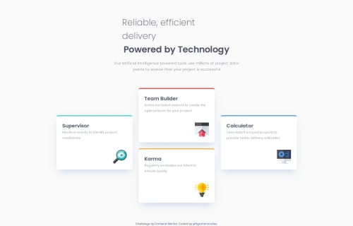
Four card feature section

Solution retrospective
I’m most proud of how well the design aligns with the provided mockup and maintains responsiveness across various screen sizes. The use of semantic HTML, including <section> for the cards and <main> for the content wrapper, ensures accessibility and a logical structure. Setting a max-width on the .cards container was an effective solution to keep the layout constrained to three columns on larger screens, preventing the cards from overflowing into a fourth column. This decision maintained the intended visual hierarchy and ensured the design remained visually balanced.
Next time, I would focus on further optimizing the layout for tablets or intermediate breakpoints, where the design could use some fine-tuning to avoid large gaps or excessive spacing. Additionally, I’d explore adding subtle animations or hover effects to the cards to enhance interactivity and user engagement. Refining the accessibility features, such as providing descriptive alt text for the icons, would also improve the overall usability of the page.
What challenges did you encounter, and how did you overcome them?The main challenge was ensuring the number of columns in the .cards section remained consistent across larger screens. Without a max-width, the flexbox layout defaulted to four columns, which disrupted the visual balance of the design. By setting a max-width on the .cards container and ensuring proper wrapping with flex-wrap: wrap, the issue was resolved, keeping the layout visually cohesive. Another minor challenge was maintaining spacing and alignment for cards that required staggered positioning, which was overcome by using transform properties on specific cards to achieve the intended design. These solutions demonstrate a thoughtful approach to layout management and responsiveness.
What specific areas of your project would you like help with?’d appreciate feedback on a few key areas of the project. First, while the max-width on the .cards container resolved the issue of maintaining three columns on larger screens, I’d like suggestions on alternative approaches to handling column layouts and wrapping more efficiently with CSS. Are there better ways to achieve this using grid or modern layout techniques?
Additionally, I’d welcome input on improving the design for tablet-sized viewports or intermediate breakpoints. Ensuring the layout feels proportional and balanced on screens between mobile and desktop sizes can sometimes be tricky, so advice on fine-tuning these transitions would be helpful. Lastly, feedback on adding subtle interactivity, such as animations or hover effects, to the cards to make them more engaging would be greatly appreciated. Let me know if there are any other best practices I could implement to enhance the project further!
Please log in to post a comment
Log in with GitHubCommunity feedback
- @VamshiReddy143
nice

Join our Discord community
Join thousands of Frontend Mentor community members taking the challenges, sharing resources, helping each other, and chatting about all things front-end!
Join our Discord