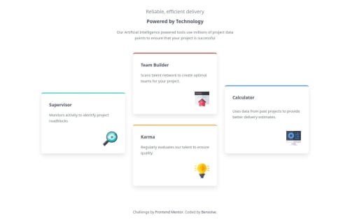
four-card-feature-section-master using grid

Solution retrospective
I’m most proud of how I used pure CSS Grid and grid-template-areas to handle a complex two-dimensional layout while keeping my HTML clean and semantic. Even with the staggered card positions, I avoided extra wrappers or unnecessary Flexbox combinations. Next time, I would explore newer layout tools like subgrid or CSS anchor positioning to simplify vertical adjustments without relying on negative margins.
The main challenge was getting the staggered vertical alignment between some of the cards, especially on desktop. Since Grid alone couldn’t fully handle the overlapping look, I used the box model — specifically margin-top and margin-bottom — to manually shift some cards into position while keeping them inside their grid areas.
I would love feedback on my current approach of combining Grid layout with margin adjustments for staggered positioning. Are there better modern techniques that could make this layout cleaner and more scalable? Suggestions on how to better handle these designs responsively would also be appreciated.
Please log in to post a comment
Log in with GitHubCommunity feedback
- P@kuba-guzynski
Your code is clear, but next time you need to put a little more work into the design. Great job!

Join our Discord community
Join thousands of Frontend Mentor community members taking the challenges, sharing resources, helping each other, and chatting about all things front-end!
Join our Discord