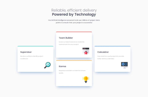
Four card feature section - No framework - Only CSS

Solution retrospective
Hey, thank you for reading this!
I started to use clamp css function. For a long time, I also used pixels and pourcentages instead of REM. I'm not fully happy about my skills even though it looks okay. I'm probably going to follow one or two courses before reworking on my projects.
Most of the time, my challenge are related to choosing the right unit and how to display the more pixel perfect with the less amount of CSS.
I read a few stuff on web.dev: it's a great ressource but I'd like to find other ressources.
What specific areas of your project would you like help with?By giving me advice about my use of CSS unit. Should I use for example ch instead of pourcentages, em, or rem?
Thank you for passing by, Tom.
Please log in to post a comment
Log in with GitHubCommunity feedback
- @neildeo
Hi Tom, think you've done a great job here and shouldn't be too hard on yourself! The design looks great at desktop and mobile sizes (although you might want to change it at intermediate sizes as the cards look a bit strange on screens of ~1000px, but that's a matter of opinion...).
Regarding your question about units, I can give some advice but only as another newbie! My understanding is that for any text element or container of a text element, it's best practice to use rem. This is because individual users can edit the text size in their browser by changing the pixel/point value of 1rem. So text on your page needs to be sized in rem, so that users can customise its size to their preference. As a consequence, any block element containing text should also be sized in rem so that your layout looks consistent regardless of the font size selected by the user. Don't forget that you can set the pixel value of 1rem in the :root selector (it defaults to 16px I think): so you can set your whole page up just using pixels, and then at the end go through and convert those all to rem by just dividing by the value of 1rem!
While the text itself should be sized using rem, I like to use the em unit for top padding and margins (NOT inline!), as by setting a single value of em (for example in the body CSS selector), the spacing looks good (i.e. big headings have more space around them than small paragraphs). I like to use ch for setting a width to a container which holds text which I know I want to take up a certain number of lines (in fact, usually a min or max width, so the container can be automatically responsive within certain screen sizes). Percentages are useful when you know how big you want something to be relative to its parent, e.g. you have an image which you want to take up half the width of its container. I also think it's absolutely fine to set image dimensions in pixels: the raw file probably has an intrinsic pixel width, and they are usually decorative elements anyway, so it doesn't matter too much if the user can't enlarge them. But you may want to consider how they affect your layout: in order to keep the layout consistent, if everything else is sized with relative units (rem, em, ch, ...) then the images also need to use these units to stay in sync with the rest of the page.
As for resources, I really recommend Kevin Powell's videos on YouTube, especially this one on responsive design. Hopefully it will help you understand how to make use of natural CSS behaviours to easily make responsive pages with minimal code! I really recommend his other videos too, they've been incredibly useful in my journey of learning HTML and CSS.

Join our Discord community
Join thousands of Frontend Mentor community members taking the challenges, sharing resources, helping each other, and chatting about all things front-end!
Join our Discord