Skip to content
  • Unlock Pro
  • Log in with GitHub
Solution
Submitted about 1 year ago

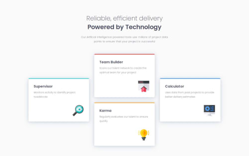
Four card feature section responsiva, usando grid e flex

Isabela Fernanda•190
@Isabela-Fernanda
A solution to the Four card feature section challenge
View live sitePreview (opens in new tab)View codeCode (opens in new tab)

Solution retrospective


What are you most proud of, and what would you do differently next time?

PT

Neste projeto, quando estava fazendo a parte do desktop, percebi que se eu mantivesse o design fornecido para mobile até a transição para desktop, a visualização em telas maiores que 700px não ia ficar boa. Então eu fiz duas @media(min-width) para aumentar a responsividade e melhorar a visualização em diferentes tamanhos de tela.

EN

In this project, when I was doing the desktop part, I realized that if I kept the design provided for mobile until the transition to desktop, the visualization on screens larger than 700px would not be good. So I did two @media(min-width) to increase responsiveness and improve viewing on different screen sizes.

What challenges did you encounter, and how did you overcome them?

PT

Foi um pequeno desafio fazer a estilização do design para desktop, pois precisava de algumas propriedades de CSS ligadas ao grid que eu não conhecia, mas dei uma pesquisada e consegui fazer.

EN

It was a little challenge to style the design for the desktop, as it needed some CSS properties linked to the grid that I didn't know, but I did some research and managed to do it.

What specific areas of your project would you like help with?

PT

Eu gostaria de receber feedbacks sobre a responsividade, se ela ficou legal e se teria algum ponto em que melhorar. Feedbacks sobre qualquer outros pontos que possam ser melhorados também serão bem-vindos.

EN

I would like to receive feedback on the responsiveness, if it was good and if there was any point to improve. Feedback on any other points that could be improved will also be welcome.

Code
Select a file

Please log in to post a comment

Log in with GitHub

Community feedback

  • irene•120
    @irene-panis
    Posted about 1 year ago

    i like the use of the two media queries -- for what it's worth i also used media query to achieve the mobile design. would love to know if theres a way to achieve the mobile design without it

Join our Discord community

Join thousands of Frontend Mentor community members taking the challenges, sharing resources, helping each other, and chatting about all things front-end!

Join our Discord
Frontend Mentor logo

Stay up to datewith new challenges, featured solutions, selected articles, and our latest news

Frontend Mentor

  • Unlock Pro
  • Contact us
  • FAQs
  • Become a partner

Explore

  • Learning paths
  • Challenges
  • Solutions
  • Articles

Community

  • Discord
  • Guidelines

For companies

  • Hire developers
  • Train developers
© Frontend Mentor 2019 - 2025
  • Terms
  • Cookie Policy
  • Privacy Policy
  • License

Oops! 😬

You need to be logged in before you can do that.

Log in with GitHub

Oops! 😬

You need to be logged in before you can do that.

Log in with GitHub

How does the accessibility report work?

When a solution is submitted, we use axe-core to run an automated audit of your code.

This picks out common accessibility issues like not using semantic HTML and not having proper heading hierarchies, among others.

This automated audit is fairly surface level, so we encourage to you review the project and code in more detail with accessibility best practices in mind.

How does the CSS report work?

When a solution is submitted, we use stylelint to run an automated check on the CSS code.

We've added some of our own linting rules based on recommended best practices. These rules are prefixed with frontend-mentor/ which you'll see at the top of each issue in the report.

The report will audit all CSS, SCSS and Less files in your repository.

How does the HTML validation report work?

When a solution is submitted, we use html-validate to run an automated check on the HTML code.

The report picks out common HTML issues such as not using headings within section elements and incorrect nesting of elements, among others.

Note that the report can pick up “invalid” attributes, which some frameworks automatically add to the HTML. These attributes are crucial for how the frameworks function, although they’re technically not valid HTML. As such, some projects can show up with many HTML validation errors, which are benign and are a necessary part of the framework.

How does the JavaScript validation report work?

When a solution is submitted, we use eslint to run an automated check on the JavaScript code.

The report picks out common JavaScript issues such as not using semicolons and using var instead of let or const, among others.

The report will audit all JS and JSX files in your repository. We currently do not support Typescript or other frontend frameworks.

Oops! 😬

You need to be logged in before you can do that.

Log in with GitHub