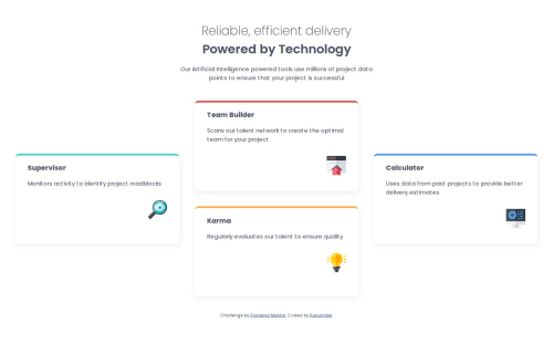
Four Card Feature Section – Responsive Layout with Unique Top Borders

Solution retrospective
I am most proud of how I: Created distinct top border colors using CSS variables and class targeting. Achieved a clean, minimal layout that adapts well from mobile to desktop using Flexbox and CSS Grid. Maintained a structured, semantic HTML layout with reusable class names.
If I were to do it again, I would: Modularize my CSS more (perhaps using SCSS or utility classes). Add keyboard/focus styles and aria-labels to improve accessibility.
What challenges did you encounter, and how did you overcome them?Challenge 1: Laying out cards uniquely on desktop I struggled with how to replicate the overlapping/staggered layout seen in the original design. Using grid-template-rows and grid-row allowed me to position each card accurately while maintaining responsiveness.
Challenge 2: Giving each card a unique top border Initially, I considered using :nth-child() but opted for explicit class names (card-supervisor, etc.) for better control and clarity. I then used CSS variables for color consistency.
Challenge 3: Ensuring mobile responsiveness The cards stacked nicely on mobile, but maintaining padding and spacing was tricky. I resolved this with media queries, careful gap usage, and scalable rem units.
What specific areas of your project would you like help with?I would appreciate feedback on the grid layout logic at larger screen sizes, especially the custom arrangement using grid-row. I am also interested in best practices for maintaining consistent spacing and responsiveness across different screen sizes without relying too much on hardcoded values.
Additionally, suggestions for improving accessibility (like semantic HTML or better text contrast) and scaling the design with utility-first CSS frameworks like Tailwind would be helpful for future projects.
Please log in to post a comment
Log in with GitHubCommunity feedback
No feedback yet. Be the first to give feedback on itunumide's solution.
Join our Discord community
Join thousands of Frontend Mentor community members taking the challenges, sharing resources, helping each other, and chatting about all things front-end!
Join our Discord