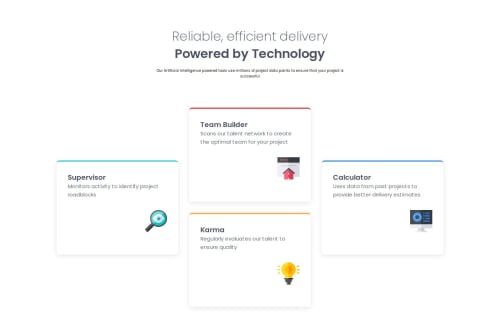
Submitted about 2 months agoA solution to the Four card feature section challenge
Four card feature section solution

P
@CiaoGab
Code
Please log in to post a comment
Log in with GitHubCommunity feedback
- @GregorDeCillia
Nice work! I like the 2 column layout in the middle. Looks good on all screen sizes. I think the mobile layout could have the title and slogan a little bit larger though.
I personally used
grid-areasinstead of grouping the 2 middle cards into a<div>but it seems to work well..cards { grid-template: 1fr 1fr 1fr 1fr / 1fr 1fr 1fr; grid-template-areas: ". T ." "S T C" "S K C" ". K ."; }

Join our Discord community
Join thousands of Frontend Mentor community members taking the challenges, sharing resources, helping each other, and chatting about all things front-end!
Join our Discord