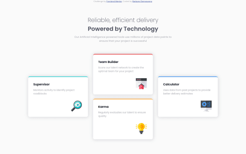
Four card feature section

Solution retrospective
Hi, how are you doing? :)
I've some questions about CSS.
On the root, I put the names the same like was in the style guide, in the "real world" is better if I choose better names to the variables? For example: "--red" is just better than "--grayishBlueT"?
Other question, sometimes I use padding or margin just on top or left, for example. I was wondering if it doesn't look ugly and maybe will be better try to keep a pattern? For a better example, the ilustration inside the card, I've used position relative and align with "right: -220px;". It was be better if I used display flex (or something else) to align to right?
First I create the desktop version and later I adapted to the mobile version, and look like there's something really wrong because I needed to do this: ".content { position: default; top: 580px; width: 300px; }"
Is this the best way to align the mobile version in this case?
Please give me your feedback, it'll help a lot. Thank! :)
Please log in to post a comment
Log in with GitHubCommunity feedback
- @0xabdulkhaliq
Hello there 👋. Congratulations on successfully completing the challenge! 🎉
- I have other recommendations regarding your code that I believe will be of great interest to you.
HTML 🏷️:
- This solution generates accessibility error reports, "All page content should be contained by landmarks" is due to incorrect usage of
semanticmarkup, which causes lacking of landmark for a webpage
- So fix it by replacing the wrapper
<div class="content">element with the semantic element<main>in yourindex.htmlfile to improve accessibility and organization of your page.
- What is meant by landmark ?, They used to define major sections of your page instead of relying on generic elements like
<div>or<span>. They are use to provide a more precise detail of the structure of our webpage to the browser or screen readers
- For example:
- The
<main>element should include all content directly related to the page's main idea, so there should only be one per page - The
<footer>typically contains information about the author of the section, copyright data or links to related documents.
- The
.
I hope you find this helpful 😄 Above all, the solution you submitted is great !
Happy coding!
Marked as helpful - @devhnry
Hello there 👋. Good job on completing the challenge !
I have SOME suggestions about your code that might interest you.
-
Regards naming your CSS Custom properties . It's okay to use the names provided in the
style-guide.md.Peronsally, for best practices try using Variable names instead, as this will also be the type of naming conventions you might use in bigger projects or challenges Example--red --cyan, Try--clr-primary-1 --clr-primary-1. -
As regards your
<div class="content" > </div>.Wrap all your body content inside a<main>...</main>as this solves the accessibility issue in your code.
.body {
    display:grid;
    place-items:center;
    min-height:100%;
}
The code above will help with centering the content and providing a much cleaner code
- As regards the Card-Icon. If you decide to use a Flex or Grid Layout for the Card Design. Adding
margin-left: autoto the card-icon should push it to the extreme right. Example
.card{ display:grid; gap:2rem; } .card__icon{ margin-left:auto; }-
To solve the issue of the responsive design. Change the media-queries to adjust when the 4 Cards can no longer be visible on a large screen
@media (min-width: 1100px){ }. -
Extra Tip: Check out BEM for better naming of classes and practice using order measurement units such as
rem em %as it boosts responsive design
I hope you these comments useful! 😄 And I was able to answer your questions
Happy coding!
Marked as helpful -


Join our Discord community
Join thousands of Frontend Mentor community members taking the challenges, sharing resources, helping each other, and chatting about all things front-end!
Join our Discord