


Gediminas Makutenas• 765
@Senatrius
Posted
Hello, and welcome to Frontend Mentor :) Made a good decision coming here, you'll learn a lot more a lot faster than you would have just by watching some videos.
Now, onto the review.
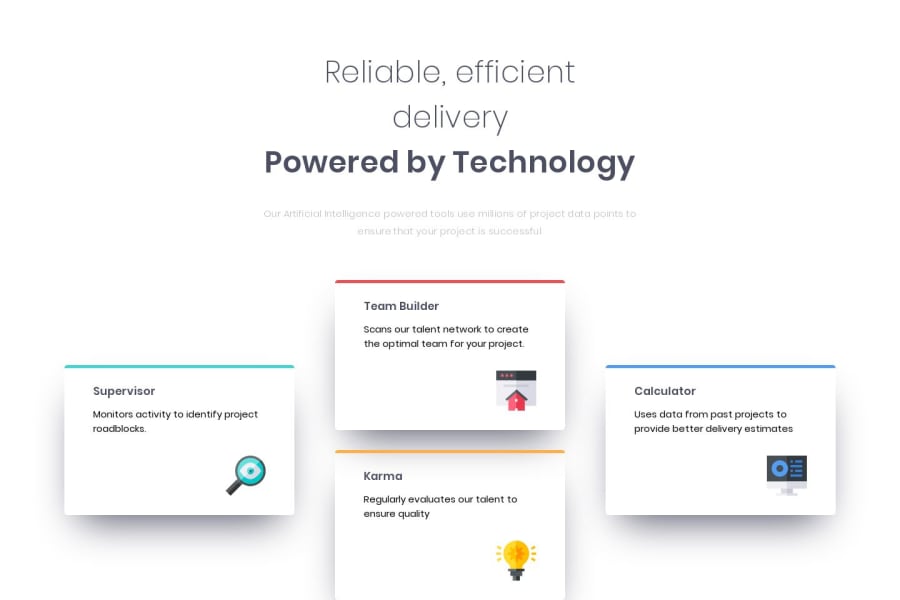
- Looking at the report, it's a good idea to align all the images using CSS instead of aligning it directly in HTML. Whether you use
position: absoluteordisplay: flexor something else is up to you. You've got a few options. - To make the website more responsive, you should add another media query at width of 880px, as currently the text wraps and the icon goes outside the container and only fixes itself at width of 425px. Reducing the margin between text and icon in the cards might work as well as switching to a single column layout a bit sooner.
- Just to make it a little nicer, add some margin to the bottom of the container like how you have it at the top.
- Code quality in general looks pretty good to me, easy enough to read and understand, can't see anything particularly wrong there.
Keep up the good work and keep coding :)
1
