Skip to content
  • Unlock Pro
  • Log in with GitHub
Solution
Submitted 3 months ago

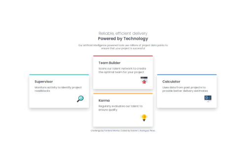
Four card feature section using CSS Grid

Gabriel Rodriguez Perez•160
@glrodriperez98
A solution to the Four card feature section challenge
View live sitePreview (opens in new tab)View codeCode (opens in new tab)

Solution retrospective


What are you most proud of, and what would you do differently next time?

I'm most proud of learning and using CSS Grid for the first time in this project. It was a new layout tool for me, and it really helped organize the cards in a clean and responsive way. Figuring out how to position the cards exactly like the design using Grid rows, columns, and grid-template-areas was a big win and boosted my confidence with layout design.

Next time, I’d spend more time experimenting with Grid early in the project instead of jumping between layout methods. I’d also try using minmax() and auto-fit/auto-fill to make my Grid even more flexible for different screen sizes, however that will need more research and practice.

What challenges did you encounter, and how did you overcome them?

One of the biggest challenges was getting the card layout to match the design across screen sizes. The cards were either too narrow or stretched out, especially on desktop, and mobile responsiveness took some back-and-forth tweaking. I solved this by adjusting the container width, card max-widths, and media query breakpoints more precisely. I also had to debug overlapping grid rules and fix conflicting styles that caused the layout to break.

What specific areas of your project would you like help with?

I’d love feedback on how to structure responsive layouts more efficiently, especially when combining Flexbox and Grid. I’d also like to get better at translating designs more precisely without relying too much on trial-and-error, and would appreciate tips on how to choose breakpoints based on the design rather than using arbitrary widths.

Code
Select a file

Please log in to post a comment

Log in with GitHub

Community feedback

  • P
    Erwin•190
    @erwindrd2
    Posted 3 months ago

    Looking good!

    However, it seems you missed the difference between the tablet and the desktop version. Look closely at the colors and location of the cards in both designs.

    When breakpoints are not clearly given in the design, it is up to the developer. Personally, I use 700 for tablet and 1100 for desktop/laptop when no hard breakpoints are given in the design. But that is just a personal preference.

Join our Discord community

Join thousands of Frontend Mentor community members taking the challenges, sharing resources, helping each other, and chatting about all things front-end!

Join our Discord
Frontend Mentor logo

Stay up to datewith new challenges, featured solutions, selected articles, and our latest news

Frontend Mentor

  • Unlock Pro
  • Contact us
  • FAQs
  • Become a partner

Explore

  • Learning paths
  • Challenges
  • Solutions
  • Articles

Community

  • Discord
  • Guidelines

For companies

  • Hire developers
  • Train developers
© Frontend Mentor 2019 - 2025
  • Terms
  • Cookie Policy
  • Privacy Policy
  • License

Oops! 😬

You need to be logged in before you can do that.

Log in with GitHub

Oops! 😬

You need to be logged in before you can do that.

Log in with GitHub

How does the accessibility report work?

When a solution is submitted, we use axe-core to run an automated audit of your code.

This picks out common accessibility issues like not using semantic HTML and not having proper heading hierarchies, among others.

This automated audit is fairly surface level, so we encourage to you review the project and code in more detail with accessibility best practices in mind.

How does the CSS report work?

When a solution is submitted, we use stylelint to run an automated check on the CSS code.

We've added some of our own linting rules based on recommended best practices. These rules are prefixed with frontend-mentor/ which you'll see at the top of each issue in the report.

The report will audit all CSS, SCSS and Less files in your repository.

How does the HTML validation report work?

When a solution is submitted, we use html-validate to run an automated check on the HTML code.

The report picks out common HTML issues such as not using headings within section elements and incorrect nesting of elements, among others.

Note that the report can pick up “invalid” attributes, which some frameworks automatically add to the HTML. These attributes are crucial for how the frameworks function, although they’re technically not valid HTML. As such, some projects can show up with many HTML validation errors, which are benign and are a necessary part of the framework.

How does the JavaScript validation report work?

When a solution is submitted, we use eslint to run an automated check on the JavaScript code.

The report picks out common JavaScript issues such as not using semicolons and using var instead of let or const, among others.

The report will audit all JS and JSX files in your repository. We currently do not support Typescript or other frontend frameworks.

Oops! 😬

You need to be logged in before you can do that.

Log in with GitHub