


@SzymonRojek
Posted
Hi Godfred,
Well done, I have checked your project and have a few tips for you:
HTML:
- the header: all these texts can be in one header tag without these unnecessary divs like you did it separately;
- I'd recommend to read more about the semantic tag, alt text (don't have to repeat words like photo, icon, image, picture etc. and alt text can be empty when the image has an only decorative role) and also about headings too, especially h1;
- check HTML issues report above and try to fix it.
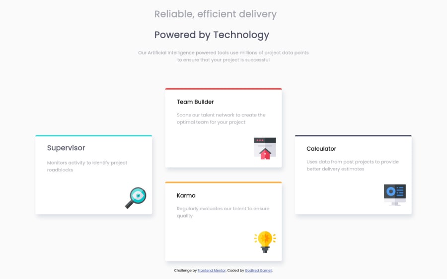
Responsiveness doesn't work well between mobile and desktop , boxes are very close to each other (check it out by inspecting all devices in your browser). I can suggest going from one column, like you did on mobiles, then create two rows with two boxes and at the end will be the desktop solution. Also, it is a bad practice to styling on tags, give padding to the elements in the box, also I think to check your all flex properties - it is something wrong with the boxes. You will see it by inspecting the project.
Check this article from the => CSS-tricks: A complete guide to FlexBox.
Ps. Don't forget to upvote any comments on here that you find helpful.
Greetings :D
@Godfredgameli
Posted
@SzymonRojek Thank you for the feedback, I will work on them.
@SzymonRojek
Posted
@Godfredgameli
Generally I have read that Grid is good for layouts and flexbox for content inside of each box. IMO grid is more complicated, I still learn it. When you decided to use a flexbox then you have to create a container for children.
For example: The flex container acts like any other block on your page. If you have a paragraph followed by a flex container, both of these things behave as we have become accustomed to block elements behaving. Then I am giving padding or margin - depends on my aims but I am trying make my elements responsive as mach as I can.
Let me know what do you think about it.
I can recommend Wes Bos, excellent tutor - he created two corses for free. Check it out:
@Godfredgameli
Posted
@Godfredgameli I have updated the code now, let me know your thoughts
