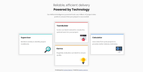
Submitted over 5 years agoA solution to the Four card feature section challenge
Four card feature section using html, css and flexbox

@swethalakshmi22
Solution retrospective
I would like to know about any suggestion for improvement.
Code
Please log in to post a comment
Log in with GitHubCommunity feedback
- @chandrasd
Looks great! as @gretagr pointed out, It would be nice have it responsive. Also the shadow around the cards should be more subtle like in the design.
Try this out for card's shadow:
box-shadow: 0px 20px 56px -6px rgba(153,153,153,1);
- @gretagr
Hi, your desktop version looks really nice! Do you plan to make it responsive? This would definitely improve your project :)


Join our Discord community
Join thousands of Frontend Mentor community members taking the challenges, sharing resources, helping each other, and chatting about all things front-end!
Join our Discord