Submitted 10 months agoA solution to the Four card feature section challenge
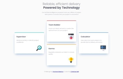
Four card feature section with CSS grid

P
@christianb3ll
Solution retrospective
What are you most proud of, and what would you do differently next time?
It was good to get to grips with grid a bit more. It's really flexible once you get the hang of it.
What challenges did you encounter, and how did you overcome them?It was a real challenge to get the design to respond correctly. I'm still not sure that the design is quite there on the mobile version. I also took the liberty of creating a 2x2 grid for medium-sized screens as both mobile and desktop versions looked awkward at that size.
What specific areas of your project would you like help with?Any pointers or comments appreciated!
Code
Loading...
Please log in to post a comment
Log in with GitHubCommunity feedback
No feedback yet. Be the first to give feedback on Christian's solution.
Join our Discord community
Join thousands of Frontend Mentor community members taking the challenges, sharing resources, helping each other, and chatting about all things front-end!
Join our Discord