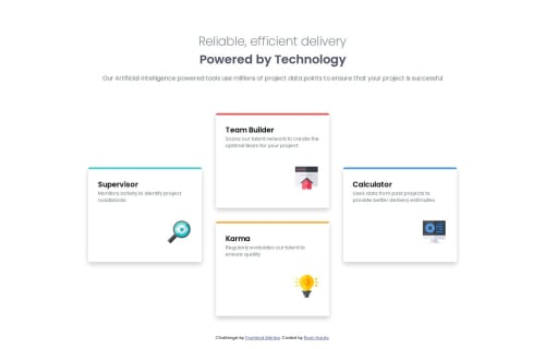
Four card feature section with CSS grid and clamp() function

Solution retrospective
I am proud of the HTML because I got it done very fast despite not taking on a frontend mentor challenge in a few months. I am also happy with the decision to go mobile-first on the design and getting the media query done. I think the final result looks really close to the design files, too.
What challenges did you encounter, and how did you overcome them?My knowledge of CSS grid is very much a work-in-progress. It took me a while to figure out how to give the grid that "staggered" layout. Also, I wanted to use the clamp() function more, and it worked eventually, but I struggled a lot with finding the right units/values to use. Like always, units are hard.
What specific areas of your project would you like help with?In my media query, I had an issue where the font would appear too large just after the transition, before becoming normal again as the width increased. I heard it's a common struggle to handle font sizes during a media query or layout transition, so any advice is welcome.
Also, I would love to get better at using the clamp() function. I had a hard time with using a mix of different units for the parameters and getting an intuition for how the function works.
Finally, feel free to give feedback in any area you see fit.
Please log in to post a comment
Log in with GitHubCommunity feedback
- P@CristianAlexa
Hi,
Looks very good. Great job.
You can also limit the width of the sub-title - you can use max-width for it. You can also use <article> instead of <div> for the .gallery-card elements.

Join our Discord community
Join thousands of Frontend Mentor community members taking the challenges, sharing resources, helping each other, and chatting about all things front-end!
Join our Discord