Submitted over 3 years agoA solution to the Four card feature section challenge
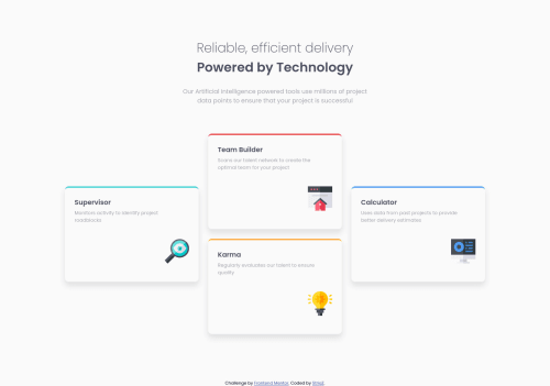
Four Card Feature Section with CSS3 and HTML5

@StrigZ
Solution retrospective
Hello!
I appreciate any recommendation. Thanks
Code
Please log in to post a comment
Log in with GitHubCommunity feedback
- @techanthere
Your solution looks great!!! But wait h1 can be the main heading with text "Reliable, efficient delivery Powered by Technology" what do you say, I don't see a reason to make it h2 maybe.
A little problem I am seeing after testing on smaller screens, a horizontal scrollbar starts showing under the width 375px and margins on right of cards starts decreasing, I couldn't understand from where did this come, can you please verify.

Join our Discord community
Join thousands of Frontend Mentor community members taking the challenges, sharing resources, helping each other, and chatting about all things front-end!
Join our Discord