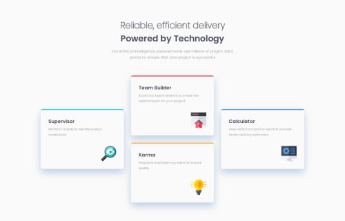
Four Card Feature Section with Grid

Solution retrospective
This was my first time really using a grid layout, so I'm happy I got it to work well. If I find time I might try and re-create with a flexbox layout, I'm not sure what is best.
What challenges did you encounter, and how did you overcome them?getting the SVG icons to maintain scale with shrinking cards / viewport width. I used a fixed position to stick it to the bottom right of the container, so maybe that was part of the problem. At a certain point the icon started overlapping with the text. I got it to scale with the parent container's size, but it would still overlap with the text before my desired breakpoint. I ended up just setting the breakpoint at a wider width before it overlapped, but I'm guessing there's a better solution.
What specific areas of your project would you like help with?Any feedback appreciated, thanks!
Please log in to post a comment
Log in with GitHubCommunity feedback
No feedback yet. Be the first to give feedback on rmmcfarlin's solution.
Join our Discord community
Join thousands of Frontend Mentor community members taking the challenges, sharing resources, helping each other, and chatting about all things front-end!
Join our Discord