Submitted 4 months agoA solution to the Four card feature section challenge
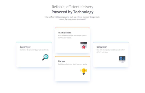
Four Card Feature Section with HTML and CSS

P
@dexterniles
Solution retrospective
What are you most proud of, and what would you do differently next time?
I'm starting to feel much more comfortable with styling based on viewport width. Overall i think this came out really nice but there are still some little things that I need to work on adjusting.
What challenges did you encounter, and how did you overcome them?Spacing for mobile continues to be an issue. I can't seem to find the right sizing combination to make it look nice. Maybe its the layout im using?
What specific areas of your project would you like help with?Spacing and adaptive sizes. Most of the stuff in here is hard coded which i know is a no no but I don't know how to do it any other way atp. Any and all help is welcomed!
Code
Loading...
Please log in to post a comment
Log in with GitHubCommunity feedback
No feedback yet. Be the first to give feedback on Dexter Niles's solution.
Join our Discord community
Join thousands of Frontend Mentor community members taking the challenges, sharing resources, helping each other, and chatting about all things front-end!
Join our Discord