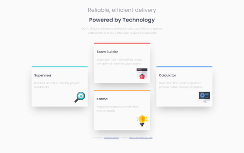
Four Card Feature Section with HTML and CSS

Solution retrospective
Told myself that I'd stop using frameworks until I got a very good grasp of HTML and CSS. Here is my first submission without a framework. Happy with the way it turned out. My understanding of how I'm manipulating the elements have grown with that experience. I know that I need to work on using semantic elements and probably making my CSS more succinct and modular. Any suggestions of where I need to improve are always welcomed!
Please log in to post a comment
Log in with GitHubCommunity feedback
- @tediko
Hello, Sebastien! 👋
Congratulations on finishing another challenge. What I can suggest is:
- Wrap your
.card,.columnand another.cardinto one wrapper. And apply these styles to this wrapper:
display: flex;
justify-content: center;
align-items: center;
Then remove
bottom: 139px;from.elevateclass. Now you will have centered cards with just flexbox - you will have to work on media queries tho, with some flex-direction: column on wrapper.- Since your images in cards are decorative your alt text should be provided empty (alt="") so that they can be ignored by assistive technologies, such as screen readers.
- Read about semantic. Semantic elements lead to more consistent code, they are easier to read and improve accessibility.
Good luck with that, have fun coding! 💪
- Wrap your

Join our Discord community
Join thousands of Frontend Mentor community members taking the challenges, sharing resources, helping each other, and chatting about all things front-end!
Join our Discord