Submitted almost 3 years agoA solution to the Four card feature section challenge
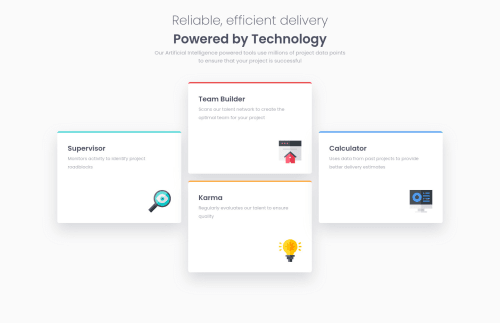
Four Card Feature Section
sass/scss

@ArmsAndArrows
Solution retrospective
I'd like to know more about mobile first, so it's a second challenge using grid and some helpful advices from previous lessons.
I have question about the fonts. Using the desktop first - it's just reducing font sizes all together with media queries during screen shrinking. But how should it work with mobile first? Shall we reduce fonts from the beginning or this is not a good idea because of accessibility reasons?
Code
Loading...
Please log in to post a comment
Log in with GitHubCommunity feedback
No feedback yet. Be the first to give feedback on Shchetkov Maksim's solution.
Join our Discord community
Join thousands of Frontend Mentor community members taking the challenges, sharing resources, helping each other, and chatting about all things front-end!
Join our Discord