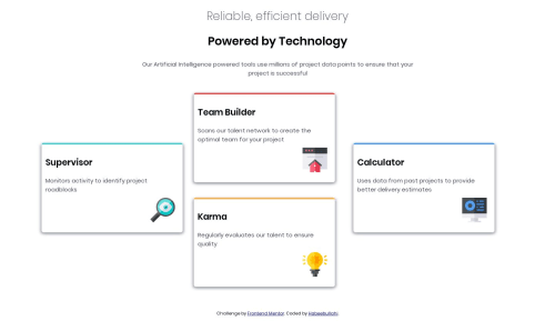
Four card feature solution (float layout)

Solution retrospective
It took me some time to find a way to vertically align the cards. And I also struggled with using media queries, (1440px didn't seem to do it). It worked fine locally but it didn't when I put it on github and vercel. Please help me anyhow you can.
Please log in to post a comment
Log in with GitHubCommunity feedback
- @ringm
Hey Habeebullahi, great work! I think the overall layout of the site looks good. And it's also responsive, congratulations.
I checked your code and I think you could achieve a better result using flexbox instead of floats. You could try something like this:
.cards {
  display: flex;
  flex-direction: column;
  align-items: center;
}

 @media (min-width: 600px) {
  .cards {
    flex-direction: row;
  }
 }
That should do the trick! In small devices your cards will display one below de other, and when the screen hits 600px size (you can change that if you like) they will display like the big screen layout.
Also, I leave you here a short article that explains all the different ways you can vertically center an element.
I hope it helps! Good luck and happy coding :)
- @blewis-1
I used the transform:translateY and translated(moved) it by 50% upwards. I added a class on both containers that needed to be vertically aligned. Note: I used flex-box.


Join our Discord community
Join thousands of Frontend Mentor community members taking the challenges, sharing resources, helping each other, and chatting about all things front-end!
Join our Discord