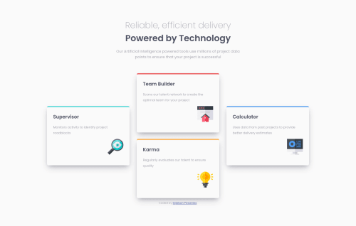
Four Card Feature Submission

Please log in to post a comment
Log in with GitHubCommunity feedback
- Account deleted
Hey @estebanp2022, some suggestions to improve you code:
-
The heading is one single heading so the entire thing should be wrapped in a single <h1> Heading along with a Span Element.
-
The Article Element should not be used as each individual card's container since they cannot stand on their own.
-
Add a third layout to make the transition from mobile 📱 -> desktop 🖥 views smoother.
-
Using CSS Grid with Grid-Template-Areas will make things way easier when building the layout; it will give you full control of the layout.
Here is an example of how it works: EXAMPLE
Desktop View Code:
.card-container {
    grid-template-columns: repeat(3, 1fr);
    grid-template-rows: repeat(2, 1fr);
    grid-template-areas:
      "supervisor team calculator"
      "supervisor karma calculator";
  }

  .karma-card {
    grid-area: karma;
  }

  .calculator-card {
    grid-area: calculator;
    align-self: center;
  }

  .team-card {
    grid-area: team;
  }

  .supervisor-card {
    grid-area: supervisor;
    align-self: center;
  }
Happy Coding! 👻🎃
Marked as helpful -
- @estebanp2022
Thank you for the feedback! I've made a few edits accordingly. I'm currently trying to use flex-box only on the layout to practice and get really comfortable with it - I will look into updating the code using Grid in the future.
TY!
Join our Discord community
Join thousands of Frontend Mentor community members taking the challenges, sharing resources, helping each other, and chatting about all things front-end!
Join our Discord