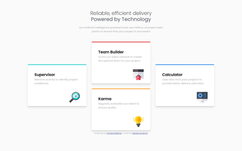
Submitted over 4 years agoA solution to the Four card feature section challenge
Four card feature using css flexbox

@SeyideHundeyin
Solution retrospective
Hi, I would appreciate any feed back. Thanks
Code
Please log in to post a comment
Log in with GitHubCommunity feedback
- @grace-snow
Hi, for me on mobile, the cards look very narrow. And the subheading text is too small for me to read, but I'm not sure if that's how the design is (some of these FM challenges have small text in the designs)
- @abhik-b
Good job Seyide 👌 Your solution seems perfect !
- It looks good on desktop
- Looks good on mobile as well
- on tablet devices it looks as desired however one card touches the bottom of screen which doesn't look good, try to have some space there
Other than that good job keep it up 💯


Join our Discord community
Join thousands of Frontend Mentor community members taking the challenges, sharing resources, helping each other, and chatting about all things front-end!
Join our Discord