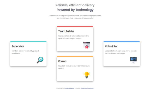
Four Card Feature using Flexbox & Responsive Design

Solution retrospective
I'm proud of the fact that this project only took me a week despite me missing my deadline by a little bit.
What challenges did you encounter, and how did you overcome them?The main issue was dealing with how to layout the elements in their respective positions, however I did some reading and found the order property for CSS Flexbox and that immediately solved the problem.
What specific areas of your project would you like help with?I have no specific areas to ask about at the moment.
Please log in to post a comment
Log in with GitHubCommunity feedback
- @MarziaJalili
Beautifully done! 👏👏👏
✅ The reason there's too much space between the card on large screens is because you haven't put a maximum width to the parent
four-cardelement.✅ To fix this set the property to a percentage value in order for it to work responsively.
✅ For example:
max-width: 80%Other than that, the web looks great!
😎😎😎
Marked as helpful - @vaibhu252frontend
1)you can make responsive design for tablet screen also. 2)you can use grid.


Join our Discord community
Join thousands of Frontend Mentor community members taking the challenges, sharing resources, helping each other, and chatting about all things front-end!
Join our Discord