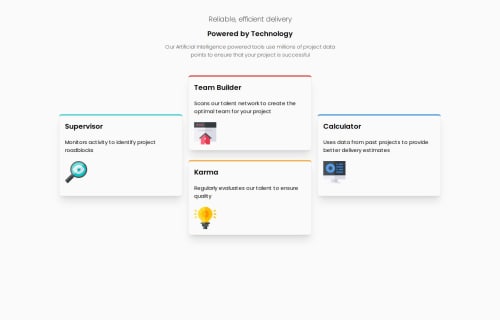
Four card feature using flexbox, tailwindcss

Solution retrospective
I am proud of learning responsive design. I would try to improve my code, making it cleaner.
What challenges did you encounter, and how did you overcome them?It was a little difficult to arrange the cards when the screen size crossed the breakpoint, I overcame by using flexbox resources.
What specific areas of your project would you like help with?I would like to know if there is a better way to code for the cards arrangements when the screen crosses the breakpoint from mobile to desktop. I did it using flexbox but I am not sure if using grid could be easier.
Please log in to post a comment
Log in with GitHubCommunity feedback
- P@JYLN
Overall, this is a great start! Here are a few things I noticed that you could potentially improve upon:
- You're using static pixels for the majority of your sizes. When a user is zoomed in or has their browser configured with a different font-size, your layout may look strange. You may consider converting your sizes into variable sizes (rems or ems) to allow for more consistent layout in these cases.
- Your icons within the cards are not positioned correctly according to the design. It appears you attempted to position them with the
justify-self-endutility class, however the parent element for the card is not using thegridutility class to allow the utility class to position your icon. You may want to refer to the Tailwind docs and choose your best approach with either grid or flexbox, then update the cards. - You may consider adding padding to your
bodyelement as when the screen resizes, your content is smashing into the sides of the viewport. - You may consider only setting bottom margin on elements when you're attempting to space out your elements. I usually find it allows me more control over where elements are positioning themselves after the spacing when using this method rather than setting a top and bottom margin on intersecting elements. Likely just a preference though.
- As accessibility is concerned, I've learned it's best practice to make the
altattribute on your images as descriptive and specific as possible if the image is not a decorative image (otherwise you'd leave the alt empty). I would say in this case, the icons are decorative, but if you choose to leave thealt, make sure they are more descriptive as screen readers will utilize your alt tag to describe the image. - I noticed you're linking some other Google fonts that you are not using within the project. You may consider refactoring your links so that just Poppins is being loaded as that's the primary font that's being used. Browsers will use whichever sans-serif font is selected in their settings as fallback rather than what else is linked unless specified.
These are just a few things I noticed and figured I could comment on based on the learning and feedback I've received on previous challenges. Great work!
Marked as helpful

Join our Discord community
Join thousands of Frontend Mentor community members taking the challenges, sharing resources, helping each other, and chatting about all things front-end!
Join our Discord