Skip to content
  • Unlock Pro
  • Log in with GitHub
Solution
Submitted about 1 year ago

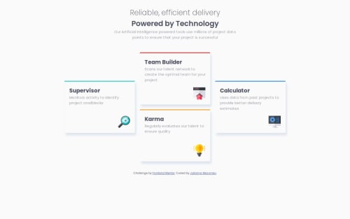
Four Card Feature with Grid and some flexbox

Julianna Messineo•290
@mathematiCode
A solution to the Four card feature section challenge
View live sitePreview (opens in new tab)View codeCode (opens in new tab)

Solution retrospective


What are you most proud of, and what would you do differently next time?

I'm proud of getting the four cards to all be positioned correctly with grid. I had to draw it out to figure out what each grid area would be, but that wasn't too hard with CSS grid. Something I would do differently next time is use CSS grid for each individual card layout as well. I used flexbox but I ran into problems placing the icon in the bottom right corner.

What challenges did you encounter, and how did you overcome them?

I couldn't figure out how to place the icon in the bottom right corner of each card. I tried using

.icon {
justify-self: flex-end;
align-self: flex-end;
}

but that didn't seem to work. I ended up having to create another div within the card div and using flex-grow to make sure that the div extended all the way to the bottom of the card.

.icon-flex {
    display: flex;
    justify-content: flex-end;
    align-items: flex-end;
    flex-grow: 1;
}

I think I could have done this more easily with grid.

What specific areas of your project would you like help with?

Is there a better way to get the icon to be in the bottom right corner without creating an entirely new div inside of the card div? I'd rather not use padding or translate because I'm not sure that would work well in a more responsive layout. I did try to use translate but it pushed down one icon more than the rest because that card had 3 lines of text and the others had 2 lines. Do you think it's more efficient to use grid or flexbox for the layout within each card?

Code
Select a file

Please log in to post a comment

Log in with GitHub

Community feedback

  • Bobby Blankson•10
    @Blanksonic
    Posted about 1 year ago

    Hello Julianna,

    I think the easiest way would be to make the card div a flex container with flex direction column

    { display: flex; flex-direction: column; }

    and align the icon on the cross axis to the left using the align-self property

    { align-self: end; }

    I hope this helps

  • Fish Ladder•140
    @fish-ladder
    Posted about 1 year ago

    Hey Julianna,

    I don't think it's necessarily better, but the way I ended up getting the icon to the bottom right was with a display: block; and margin-left: auto;

    And I just stuck with the default flow layout for each card with some padding and a text-align: left; (which I now notice I duplicated for some reason - lol).

    Feel free to check out my code if you want to see specifics: https://github.com/fish-ladder/four-card-feature-section-master

    Hope that helps!

    Joe

Join our Discord community

Join thousands of Frontend Mentor community members taking the challenges, sharing resources, helping each other, and chatting about all things front-end!

Join our Discord
Frontend Mentor logo

Stay up to datewith new challenges, featured solutions, selected articles, and our latest news

Frontend Mentor

  • Unlock Pro
  • Contact us
  • FAQs
  • Become a partner

Explore

  • Learning paths
  • Challenges
  • Solutions
  • Articles

Community

  • Discord
  • Guidelines

For companies

  • Hire developers
  • Train developers
© Frontend Mentor 2019 - 2025
  • Terms
  • Cookie Policy
  • Privacy Policy
  • License

Oops! 😬

You need to be logged in before you can do that.

Log in with GitHub

Oops! 😬

You need to be logged in before you can do that.

Log in with GitHub

How does the accessibility report work?

When a solution is submitted, we use axe-core to run an automated audit of your code.

This picks out common accessibility issues like not using semantic HTML and not having proper heading hierarchies, among others.

This automated audit is fairly surface level, so we encourage to you review the project and code in more detail with accessibility best practices in mind.

How does the CSS report work?

When a solution is submitted, we use stylelint to run an automated check on the CSS code.

We've added some of our own linting rules based on recommended best practices. These rules are prefixed with frontend-mentor/ which you'll see at the top of each issue in the report.

The report will audit all CSS, SCSS and Less files in your repository.

How does the HTML validation report work?

When a solution is submitted, we use html-validate to run an automated check on the HTML code.

The report picks out common HTML issues such as not using headings within section elements and incorrect nesting of elements, among others.

Note that the report can pick up “invalid” attributes, which some frameworks automatically add to the HTML. These attributes are crucial for how the frameworks function, although they’re technically not valid HTML. As such, some projects can show up with many HTML validation errors, which are benign and are a necessary part of the framework.

How does the JavaScript validation report work?

When a solution is submitted, we use eslint to run an automated check on the JavaScript code.

The report picks out common JavaScript issues such as not using semicolons and using var instead of let or const, among others.

The report will audit all JS and JSX files in your repository. We currently do not support Typescript or other frontend frameworks.

Oops! 😬

You need to be logged in before you can do that.

Log in with GitHub

Oops! 😬

You need to be logged in before you can do that.

Log in with GitHub