Skip to content
  • Unlock Pro
  • Log in with GitHub
Solution
Submitted about 1 month ago

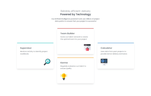
Four Card Features Section

tailwind-css
newJSHacker•90
@laravue-18
A solution to the Four card feature section challenge
View live sitePreview (opens in new tab)View codeCode (opens in new tab)

Solution retrospective


What are you most proud of, and what would you do differently next time?

I'm most proud of how clean and structured my HTML and layout turned out. I made good use of Tailwind CSS utility classes to keep the code minimal yet responsive and visually consistent. The grid layout works well across screen sizes, and the visual hierarchy (headings, spacing, and card components) effectively presents the content.

If I were to do this project again, I’d focus more on accessibility and fine-tuning the design polish. For example, I would improve the contrast for better readability, add proper alt text and ARIA attributes to support screen readers, and maybe add interactive elements like hover effects or animations to bring the UI to life. I'd also consider separating content into components or sections to make the structure more semantically rich.

What challenges did you encounter, and how did you overcome them?

One of the main challenges I faced was structuring the layout in a way that remained responsive across different screen sizes, especially when aligning the cards in the center and making sure the spacing felt balanced on both mobile and desktop. Tailwind CSS made this easier, but I still had to experiment with the grid system and spacing utilities to get it just right.

Another challenge was ensuring consistency in design while using utility-first classes. It’s easy to clutter HTML with too many classes, so I had to stay intentional and organized. I overcame this by sticking to Tailwind’s naming conventions and checking the design against the original challenge reference frequently.

What specific areas of your project would you like help with?

I’d appreciate feedback on accessibility and semantic HTML. I want to make sure my structure is screen-reader-friendly and follows best practices for inclusive design. Also, I’d like advice on how to improve the visual polish of the layout—like adding subtle animations or hover effects using Tailwind CSS to make the cards feel more interactive and modern.

Lastly, if there are more efficient ways to organize or reuse Tailwind utility classes (like using components or applying custom styles), I’d love to learn about that too.

Code
Loading...

Please log in to post a comment

Log in with GitHub

Community feedback

  • P
    Ashmit-kansal•240
    @Ashmit-kansal
    Posted about 1 month ago

    Amazing but I think you forgot to create specific grid design for tablet version.

    You should create it using 2 columns and increasing the span to 2 for 1 and 4 section.

Join our Discord community

Join thousands of Frontend Mentor community members taking the challenges, sharing resources, helping each other, and chatting about all things front-end!

Join our Discord
Frontend Mentor logo

Stay up to datewith new challenges, featured solutions, selected articles, and our latest news

Frontend Mentor

  • Unlock Pro
  • Contact us
  • FAQs
  • Become a partner

Explore

  • Learning paths
  • Challenges
  • Solutions
  • Articles

Community

  • Discord
  • Guidelines

For companies

  • Hire developers
  • Train developers
© Frontend Mentor 2019 - 2025
  • Terms
  • Cookie Policy
  • Privacy Policy
  • License

Oops! 😬

You need to be logged in before you can do that.

Log in with GitHub

Oops! 😬

You need to be logged in before you can do that.

Log in with GitHub

How does the accessibility report work?

When a solution is submitted, we use axe-core to run an automated audit of your code.

This picks out common accessibility issues like not using semantic HTML and not having proper heading hierarchies, among others.

This automated audit is fairly surface level, so we encourage to you review the project and code in more detail with accessibility best practices in mind.

How does the CSS report work?

When a solution is submitted, we use stylelint to run an automated check on the CSS code.

We've added some of our own linting rules based on recommended best practices. These rules are prefixed with frontend-mentor/ which you'll see at the top of each issue in the report.

The report will audit all CSS, SCSS and Less files in your repository.

How does the HTML validation report work?

When a solution is submitted, we use html-validate to run an automated check on the HTML code.

The report picks out common HTML issues such as not using headings within section elements and incorrect nesting of elements, among others.

Note that the report can pick up “invalid” attributes, which some frameworks automatically add to the HTML. These attributes are crucial for how the frameworks function, although they’re technically not valid HTML. As such, some projects can show up with many HTML validation errors, which are benign and are a necessary part of the framework.

How does the JavaScript validation report work?

When a solution is submitted, we use eslint to run an automated check on the JavaScript code.

The report picks out common JavaScript issues such as not using semicolons and using var instead of let or const, among others.

The report will audit all JS and JSX files in your repository. We currently do not support Typescript or other frontend frameworks.

Oops! 😬

You need to be logged in before you can do that.

Log in with GitHub