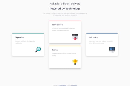
Four Card Section responsive layout HTML + CSS

Solution retrospective
I would much appreciate comments and suggestion for improvement where possible.
Please log in to post a comment
Log in with GitHubCommunity feedback
- @GerbenDol
Hey Diego, your solution is looking super nice! Love the switch in layout between desktop and mobile! 😁
One thing that would greatly improve your solution and also your future solutions would be: Try bundling all shared styles in one class. Right now you write the same common styles for each card on each individual class.
Try splitting that up by adding multiple classes in your HTML, so you get something like:
- A
.cardclass that has all common styles, such as box-shadow, padding, background-color, etc. - A more specific class, for example
.card-supervisorthat sets it's specific position, the border color, etc.
Doing this, and practicing this in other projects will help you:
- Maintain code. If the card needs to be changed now you will only need to edit 1 set of CSS, instead of do it for each card
- Reduce code size, as this simply saves you duplicate code
If you want to learn more about this try looking for keeping your CSS DRY (=don't repeat yourself) 🤓
Good luck on your next challenges! 💪🏻
- A
- @Mieibi
Hey Diego, I love the transition of the webpage from desktop to mobile view really smooth. Good job 💯.


Join our Discord community
Join thousands of Frontend Mentor community members taking the challenges, sharing resources, helping each other, and chatting about all things front-end!
Join our Discord