Submitted almost 4 years agoA solution to the Four card feature section challenge
Four Cards Section w/ CSS grid and 2 breakpoints

@Sloth247
Solution retrospective
I set 2 break points to make the cards look better. Any feedbacks are welcome!
Code
Please log in to post a comment
Log in with GitHubCommunity feedback
- @vanzasetia
👋Hi Sloth!
I have some feedback on this solution:
ptags should never be a children ofh1instead I recommend to use this markup.
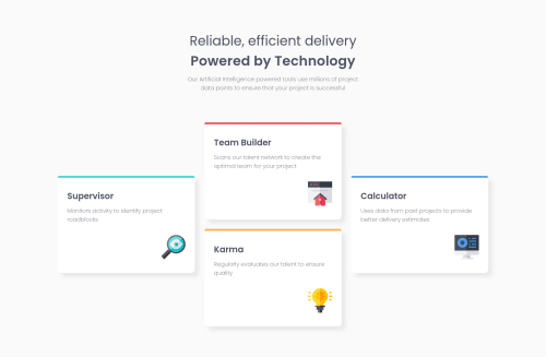
<h1>Reliable, efficient delivery <span>Powered by Technology</span> </h1>- I recommend to use
headertag since the class name isheaderso it becomes more semantic rather thandiv - Your BEM is for this class
card card__supervisor, I recommend to change it as a modifier like thiscard card--supervisor. - I recommend to leave the default
htmlfont size which is100%. The problem with setting it to62.5%, it will make the user that has bad vision have to zoom a lot since it will always 62.5% of the current size. Yes, it makes developer easier to calculate 1rem but the purpose is not about what convenient for the developer, it's about what convenient to the user.
That's it! Hopefully this is helpful!
Marked as helpful

Join our Discord community
Join thousands of Frontend Mentor community members taking the challenges, sharing resources, helping each other, and chatting about all things front-end!
Join our Discord