Submitted over 5 years agoA solution to the Four card feature section challenge
Four Cards solution, using CSS Flexbox layout and SCSS

@rwaterlow
Solution retrospective
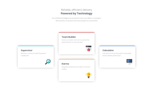
I was thinking more dynamically initially when planning the solution, i.e. avoiding putting each box in specific columns, so if more boxes were added in future the shape of the design would evolve. I combined this with my own challenge of using only CSS Flexbox layout, not CSS Grid.
In the end I couldn't achieve the cross shape without combining 2 of the boxes into the middle column using CSS Flexbox.
Has anyone created/found a solution using these same parameters?
Code
Loading...
Please log in to post a comment
Log in with GitHubCommunity feedback
No feedback yet. Be the first to give feedback on Rufus's solution.
Join our Discord community
Join thousands of Frontend Mentor community members taking the challenges, sharing resources, helping each other, and chatting about all things front-end!
Join our Discord