Please log in to post a comment
Log in with GitHubCommunity feedback
- @DAJ350
Hey, great work attempting this project!
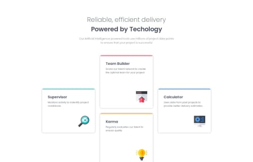
I was impressed by your approach to recreating the card container layout. Just goes to show just how useful Flex-box can be.
If you were to look into improving this code, I'd suggest revisiting the dimensions of the card as well as the passive white space around the text in the header. You want to try and get it to match as closely as you can to the design. To give yourself a challenge, perhaps reattempt creating the card container layout with CSS Grids.
Well done, once again. Happy Coding!
- @WhitezerD
-I think you should use more semantic tags in html than <div> elements. -It's better to styles from mobile or smaller screen first and add more later in a bigger sceen. -I notice that on the desktop screen, .two-card-section was not same size as the other container
BTW nicely done, keep doing the good work.
Join our Discord community
Join thousands of Frontend Mentor community members taking the challenges, sharing resources, helping each other, and chatting about all things front-end!
Join our Discord