Not Found
Not Found
Not Found
Not Found
Not Found
Not Found
Not Found
Not Found
Not Found
Not Found
Not Found
Not Found
Not Found
Not Found
Not Found
Not Found
Not Found
Not Found
Not Found
Not Found

Submitted

Frontend Development Workflow of Age Calculator App

#accessibility
P
Roksana• 330

@tloxiu

Desktop design screenshot for the Age calculator app coding challenge

This is a solution for...

  • HTML
  • CSS
  • JS
2junior
View challenge

Design comparison


SolutionDesign

Solution retrospective


What are you most proud of, and what would you do differently next time?

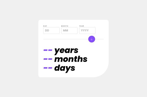
I most proud of making bigger script in js, cause i want to learn it so badd, and I guess I would do differently the years, months and day calculation, maybe with some library the next time.

What challenges did you encounter, and how did you overcome them?

What specific areas of your project would you like help with?

I would like to hear an opinion about the accessibility, exactly the ARIA attributes things, and I would like the help with positioning the button on desktop design properly.

Community feedback

P
tediko• 6,580

@tediko

Posted

Hello @tloxiu!

I can't keep up with your pace! Good job on this challenge. Some things I'd change:

  • Don’t combine landmarks like main with the role attribute. It is redundant. Semantic elements each have an implicit role. A landmark is an abstract role for a section of content that allow assistive technologies to navigate and to find content quickly.
  • Wrap your divs that contain inputs and labels with <fieldset> element, which is used to group several controls as well as labels within a form.
  • Instead of hiding your label with .sr-only class, remove your .input-title paragraph and show label instead. That's what they are for in cases like this where you have visible label in design.
  • Remove aria-labelledby in your inputs. This is what label is for. To represent a caption for an item in a user interface which in your case is input element. for attribute in label should always point to id of proper input.
  • Remove aria-labelledby from .result-section section. First of all it doesn't point to anything since you don't have Results-heading id on any of this headings. Adding labels to sections that already have headings creates a load of annoying unnecessary noise. Most screen reader users rely on headings for navigation.
  • h1 is reserved for title of the page only, you shouldn't have multiple h1's on page. I'd wrap these results with one <p> tag instead.
  • You can additionally add h1 element for your app and hide it with .sr-only since your app doesn't have title.
  • Move your styles from form to fieldset and remove max-width. Instead, add that max-width on your .wrapper element like width: 100%; max-width: 720px. Remember to hide default border on fieldset. Remember to remove min-width and max-width from .card since we set that to .wrapper container.
  • Add some class name for input and label div wrappers and style them with max-width: 160px; width: 100%; so they don't grow more than expected in design.
  • Instead of having section for divider and button, move that section within your form (outside of fieldset) and change tag to div. Replace <hr> element with div and add height: 2px; background: your-color.

Have fun!

Marked as helpful

2

P
Roksana• 330

@tloxiu

Posted

Hello again! I'd be lying if I said I wasn't waiting for your opinion. Thanks again a lot! :) @tediko

0
voke• 210

@vo-ke

Posted

no js? lol its an incomplete project blud

0

P
Roksana• 330

@tloxiu

Posted

Well, the files on github got corrupted, but I replaced them with the files on my computer, so everything works fine. @vo-ke

0

Please log in to post a comment

Log in with GitHub
Discord logo

Join our Discord community

Join thousands of Frontend Mentor community members taking the challenges, sharing resources, helping each other, and chatting about all things front-end!

Join our Discord