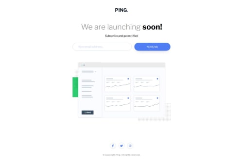
Submitted over 1 year agoA solution to the Ping single column coming soon page challenge
Frontend Development Workflow of Ping Single Coming Soon Page

@tloxiu
Solution retrospective
Feedback welcome! (I had a problem with the text in the button in the desktop version.)
Code
Couldn’t fetch repository
Please log in to post a comment
Log in with GitHubCommunity feedback
- @tediko
Hello @tloxiu!
Great to see another challenge solution from you! A few suggestions from me:
- Move
headerandfooterout ofmain. The main content area consists of content that is directly related to or expands upon the central topic of a document or an application where header/footer excludes contant that is repeated across a set of documents such as site navigation links, logos, banners etc which means we can consider them as adjacent content. - Your
.logois decorative so keep youralttext empty and addaria-labelattribute to your anchor instead so non-sighted users know where this link is pointing to. Something likearia-label="Ping - Home"would be nice. - You should add
labelfor yourinputand hide it with somesr-onlyclass. The<label>element represents a caption for your input. .social-mediasis clearly a navigation. Nav element represents a section of a page whose purpose is to provide navigation links, either within the current document or to other documents which is true in your case. Changedivtag to<nav>and next you should wrap your links inside unordered-list<ul>. Addaria-labelattributes to your links to announce where those links are pointing to non-sighted users.- You're using broad names for color variables within your css. Try to make them more descriptive so you can use them easier within your code. Each color have its own name so instead prefix them with
--c-or--clr-like--c-blue,--c-blue-paleit will be easier for you to write code since if you start typing--cit will display you all colors and then if you have different variables for maybe fonts, background etc they'll be grouped like--c-,--bg-,--font-etc. - Let's take a look at
inputandbuttonelements. You don't want to make width of your input using padding. Instead remove all paddings values from.email-inputand set it topadding: 1remfor now (you can modify it later to fit design). Next, addmax-width: 350pxto allow your input to take 100% width and limit it at 350px so it wont grow bigger. Next, removepaddingfrom button for now. You want your button to take 100% height of input, and space that is left within container. To do so, just addflex: 1property to your button so it stretches full avaible width and height. As you can see now your button lacks of height on mobile resolution. You need to match height of input so this is where you addpadding: 1remjust like you add to your input.
Have fun!
Marked as helpful - Move
- @AshongAbdallah06
A few suggestions? On the
inputelement, you have unnecessarypaddingthat looks great, but when the user types a long email, it cuts off, while there is so much space on the right. Try reducing thepaddingand increasing thewidth.One more thing: take the
headerandfootertags out of themain.The responsiveness is just marvelous. 🤝🎉😊 I love it
Marked as helpful


Join our Discord community
Join thousands of Frontend Mentor community members taking the challenges, sharing resources, helping each other, and chatting about all things front-end!
Join our Discord