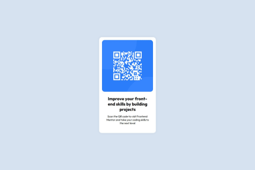
Frontend mentor QR code component solution

Please log in to post a comment
Log in with GitHubCommunity feedback
- @OscarE2D
✅ What’s Done Really Well:
🧱 Clear and Clean HTML Structure
- You correctly used fundamental HTML tags (
<!DOCTYPE html>,<html>,<head>,<body>). - You neatly separated the visual sections: image and text.
- The use of class names like
.white-container,.img-container, and.textis descriptive and semantically helpful.
🎨 Well-Organized Styles
- You applied a basic reset with
* { margin, padding, box-sizing }, which is excellent for creating a consistent starting point. - Great choice of font with Google Fonts (
Outfit) and proper use offont-familyon thebody. - The layout is vertically and horizontally centered using Flexbox on the
body, which is a great modern practice. - The use of soft colors (
hsl(212, 45%, 89%)andhsl(0, 0%, 100%)) gives the design a professional and pleasant appearance.
📱 Responsive Without Complexity
- The main container’s width (
320px) is ideal for mobile, and thanks toflex, it adapts well to most screen sizes without breaking.
🛠 Suggestions for Further Improvement:
🧩 1. CSS Placement
- Although it’s okay to include
<style>in the same file for small projects, the ideal practice is to separate the CSS into an external file (styles.css). This improves organization as your project grows.
🖼 2. Improving Image Accessibility
-
Currently, the
alt=""is empty. While valid, it’s better to use a descriptive text such as:<img src="./images/image-qr-code.png" alt="QR code linking to Frontend Mentor" />This helps users who rely on screen readers.
📐 3. Font Size and Visual Hierarchy
-
The
font-size: 15pxis fine, but you could consider usingreminstead ofpxto improve accessibility and scalability:font-size: 0.9375rem; /* equivalent to 15px */ -
You could also use
clamp()in the future to make font sizes fluid, like:font-size: clamp(0.875rem, 1vw + 0.5rem, 1rem);
🔤 4. Using Relative Instead of Fixed Units
-
Instead of
width: 320px, you could practice using units likemax-widthorclamp():max-width: 320px; width: 90%;
This makes the layout more adaptable to smaller screens without needing media queries.
✨ 5. Optional Semantic HTML
- Although not required, you might consider using a
<main>instead of thediv.white-container, and a<section>for the text content. This improves semantic structure for accessibility and SEO.
🏁 Final Summary:
The design is clean, well-organized, and functional. The use of Flexbox, Google Fonts, and harmonious colors shows attention to detail.
🎉 Congratulations! You’re building a very solid foundation. These suggestions are just to help you keep growing and prepare for more complex projects. Keep it up! 🚀
- You correctly used fundamental HTML tags (

Join our Discord community
Join thousands of Frontend Mentor community members taking the challenges, sharing resources, helping each other, and chatting about all things front-end!
Join our Discord